Tuxford Self Storage Branding


Honest Acorn – Concept 1
Natural, Plentiful & Talented.
Acorn housed in a green rounded rectangle. Acorns are natural which gives this logo an “honest” look. The acorn has been positioned slightly on its side to suggest it is leaning again the edge of the box as though it is being stored within the green box.
Sleek+ – Concept 2
Modern, minimal & simple.
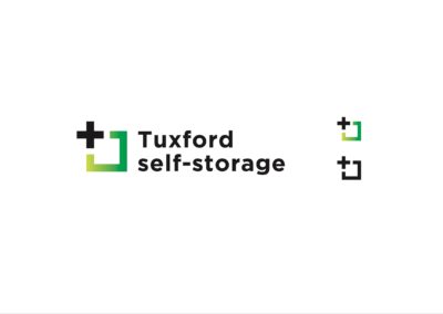
A “+,” positive symbol has been set in the upper left corner of the square that has a green gradient. This represents the service of “adding,” more space. The logo has been set in “Gotham,” which is a typeface used in various political campaigns (in the USA) for its simple & honest aesthetic.
Simple & Secure – Concept 3
Secure, Relaxed & Local.
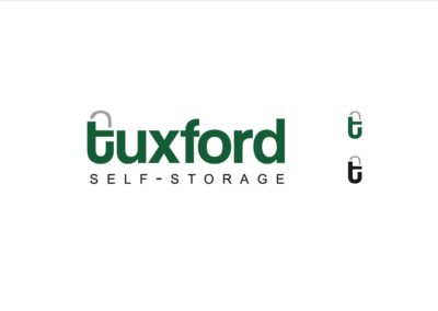
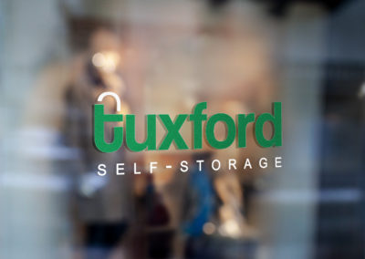
The lower case ‘T,’ has had a grey arch imposed above, turning the ‘t,’ into a padlock, this smaller icon can be used independently of the full logotype. The word “Tuxford,” has been set in lower case to give the logo a relaxed feel, which makes the company more approachable.


