The Terp Shack Logo
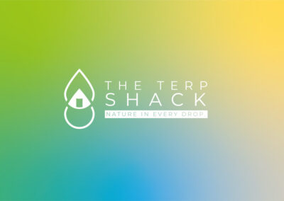
Double Drop – Concept 1
Clean, Simple & Modern
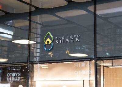
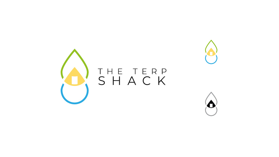
The main logo here is two overlapping outlines of droplets and in the creating a smaller triangle that is a solid yellow.
There has been a curved rectangle at the front of the triangle making the shape into a hut/shack.Yellow is not only halfway between blue and green on the colour spectrum but is also similar to the colour of the extracts. A light shade of blue signifies a small water droplet and the top half of the logo is green, subtlety echoing the nature/shape of a leaf.
The type “Montserrat,” is a modern sans serif typeface. Additionally, it has been set in all-caps to a provider and strong, confident & authoritative feel. Finally, the tracking has been set high so that letters are spaced out this is often done with luxury brands & gives marks a high-end feel.
Humble Shack – Concept 2
Small & Honest
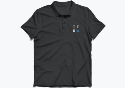
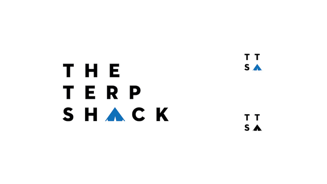
This is a logotype that can be reduced to an icon that features the company initials and the symbol/icon of the hut.
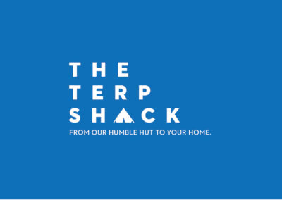
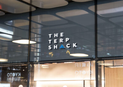
The “A” of shack has been replaced with an icon of a shack, providing a humble small feel to the mark. I have used a darker blue that provides better balance with the bold typeface so the two visual elements are not competing with each other.
Similar to concept one, type I’ve been tracked out providing a luxury/high-end feel. However, the weight & height of the typography being thicker allows the tone of the lettering to be more friendly reflecting and honest approachable value.
Mary Flow – Concept 3
Natural & Friendly
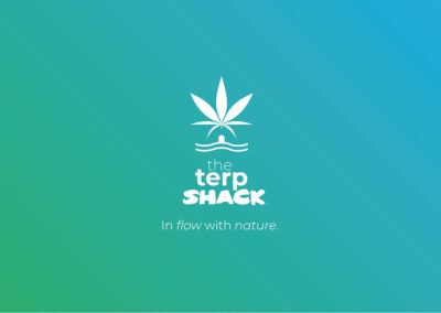
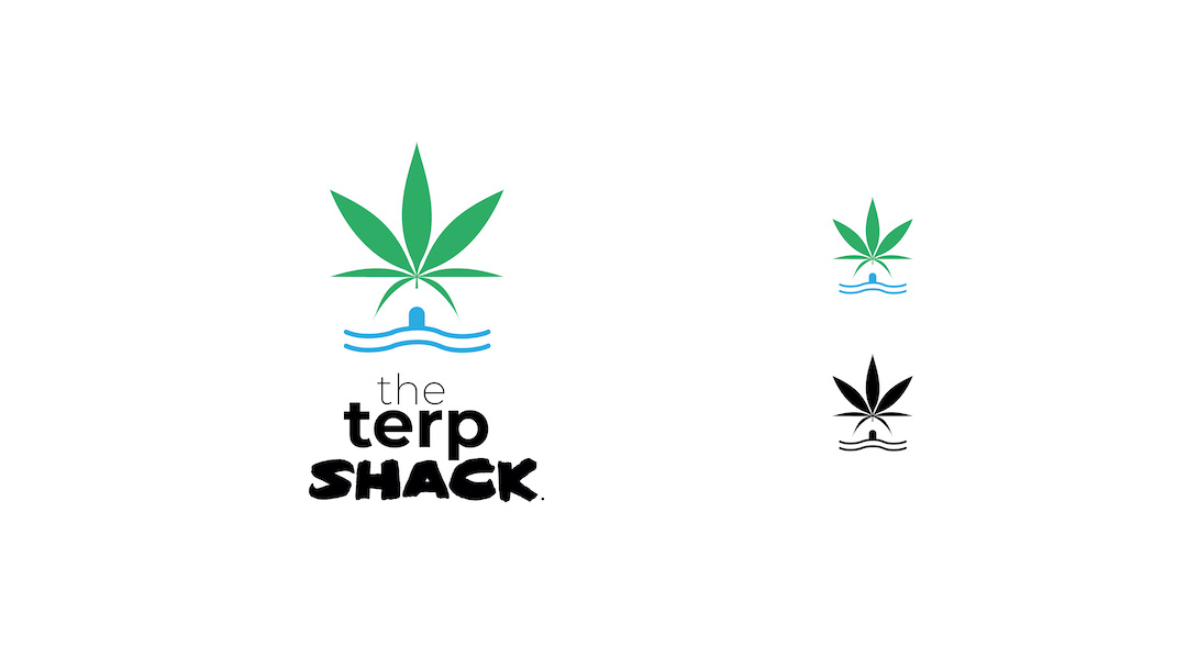
The main visual element of the logo is the cannabis leaf. However, it has been shaped so the lower leaves create, palm style leaves which can be used as roofing elements for rural building in tropical climates. This is paired with some wavy blue lines that signify the natural flow of the ocean.
Making the suggestion the hut is on the beach. Between the water and the leaf, there is an arched top rectangle that creates a doorway that transforms the negative space into a hut with the leaves as the roof and with the water flowing past the doorstep.
The logotype has been centralised whilst “Gotham,” typeface provides a modern, clean feel it has intentionally been set in lowercase to make it less formal.The clean modern Gotham type is contrasted by the heavy brush script, which gives the logo a natural beach-ey vibe. Additionally, the brush script when paired with the playful way the negative space has been used in the logo creates a friendly feel to the mark.


