The Family Logo


“The Family,” – Concept 1
Small, Community, Gangster
The phrase “The Family,” is often used to represent organised crime families (especially when set in italics). This has been set in a bold all-caps serif typeface that makes the logo look sharp and a little menacing.
Organised crime in Japan is orchestrated by the “Yakuza,” The English equivalent for the term Yakuza is gangster, meaning an individual involved in a Mafia-like criminal organization. This makes the group something of a gang giving the branding an ironic “tongue & cheek feeling”.
This has been book-ended with a red circle which is an oversized full stop and symbolises the Japanese rising sun.
Miso Jap – Concept 2
Japanese, Funny
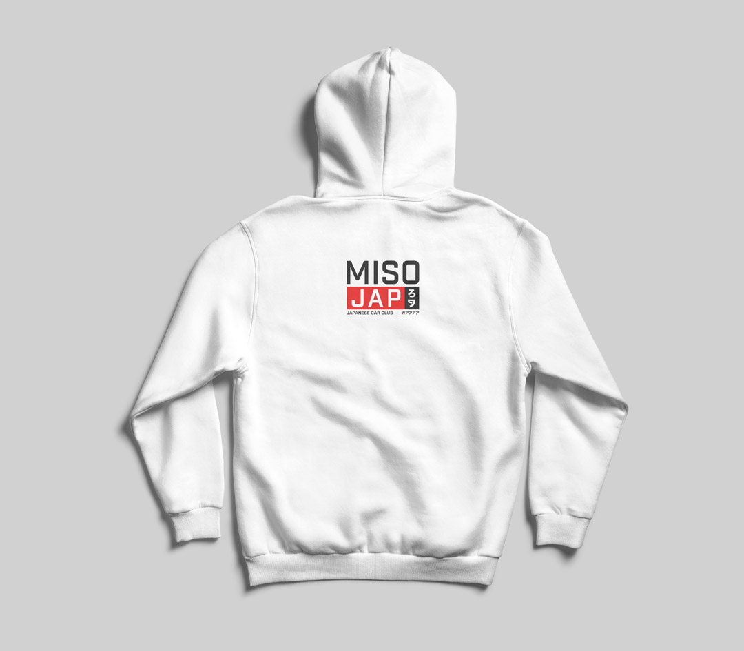
This concept is a twist on “2 Live Crew – Me So Horny,” instead of being “Horny,” it reads “Me So Jap,” so group members are very Japanese.
This idea is played upon further in the tagline which reads…“Much JDM, Very Drift, Many Fujis,” which is a play on the doge meme. This highlights we aren’t taking the branding seriously and that it is playful and funny. Whilst casting shade at those generic groups that force in Japanese imagery and end up looking the same as each other. i.e. many Jap groups overuse Fuji imagery and phrases like “JDM,” & “Drift,”
Cherry Blossom – Concept 3
Small, Young, Light
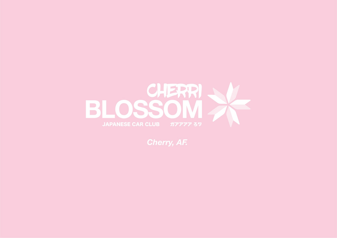
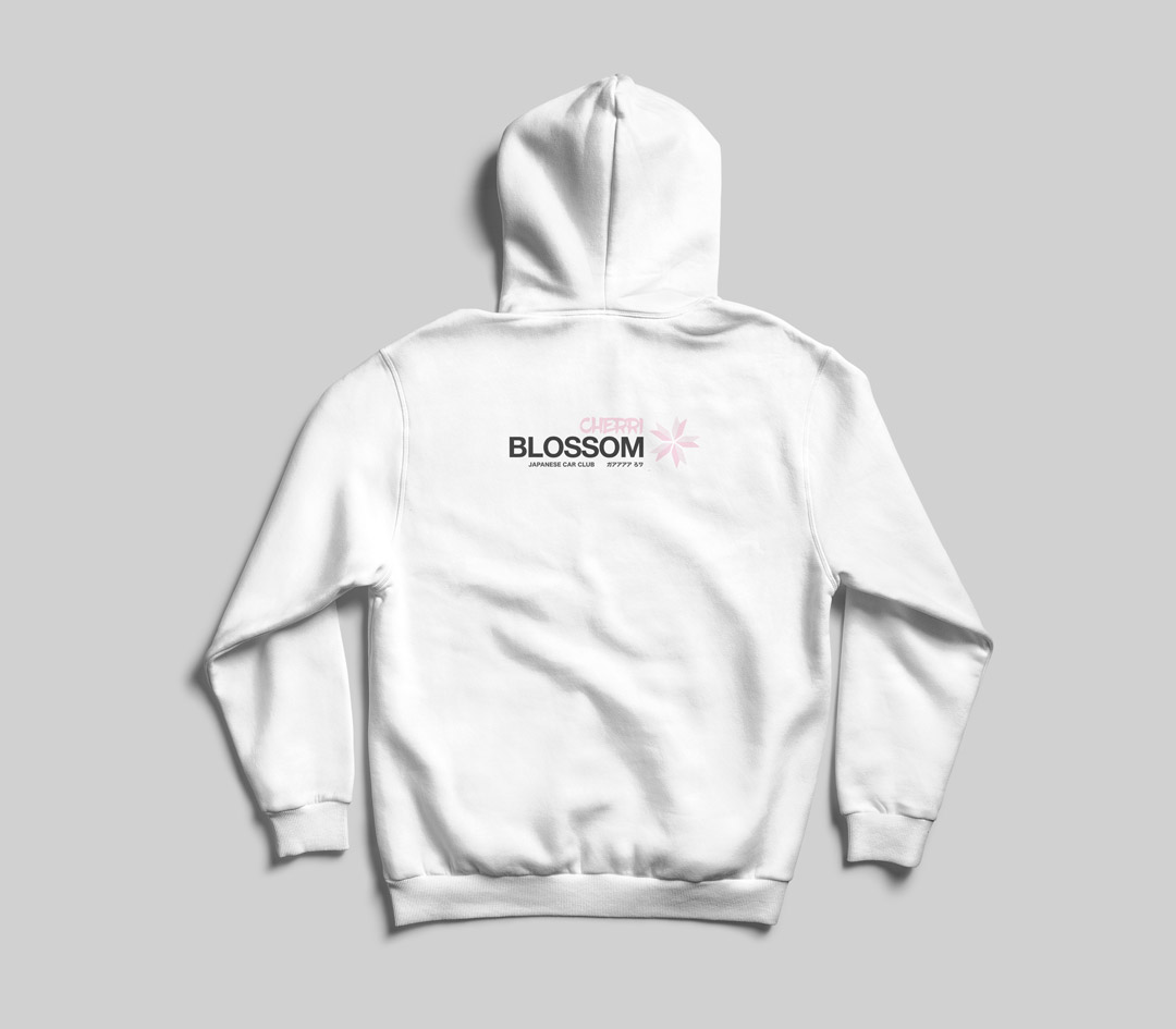
In Japan, cherry blossoms are called Sakura, a special flower for the people and the country. Cherry blossoms are a symbolic flower of the spring, a time of renewal, and the fleeting nature of life.
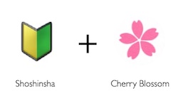
The mark combines the “Shoshinsha,” (Japanese learner driver symbol, like a Japanese L Plate) with the cherry blossom, so when read literally the logo represents 5 learners coming together to build a community.
The colouring on this concept is a little more feminine but this could be beneficial for targeting female car enthusiast as there are many clubs that have this focus.


