Royal Scaffolding Logo & Branding


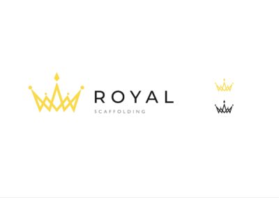
Luxury Poles – Concept 1
HIGH-END/MODERN
The logo here is a crown made up of individual overlapping “poles,” making a crown. The logotype is set in all caps, sans-serif, “Montserrat,” and has been tracked out, making the spacing between letters bigger. This has been done to emulate mainstream luxury brands. This would appeal to both commercial and domestic customers for high-value projects. However, it has been tailored more for high-income domestic customers.
Royal “R” – Concept 2
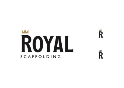
BOLD/TRADITIONAL
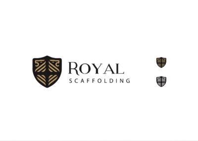
Serif typography has been used to create a more traditional style. Additionally, “Royal,” has been set in all- caps which adds to the regal theme as, making the type seem “proud” and “confident” as though.
“Scaffolding,” has been set in “Gill Sans,” which is a discreet British typeface and has been chosen for its legibility and the contrast it provides when countered the serif typography. In lay-mans top texts seems fancy because the subtitle is intentionally plain.
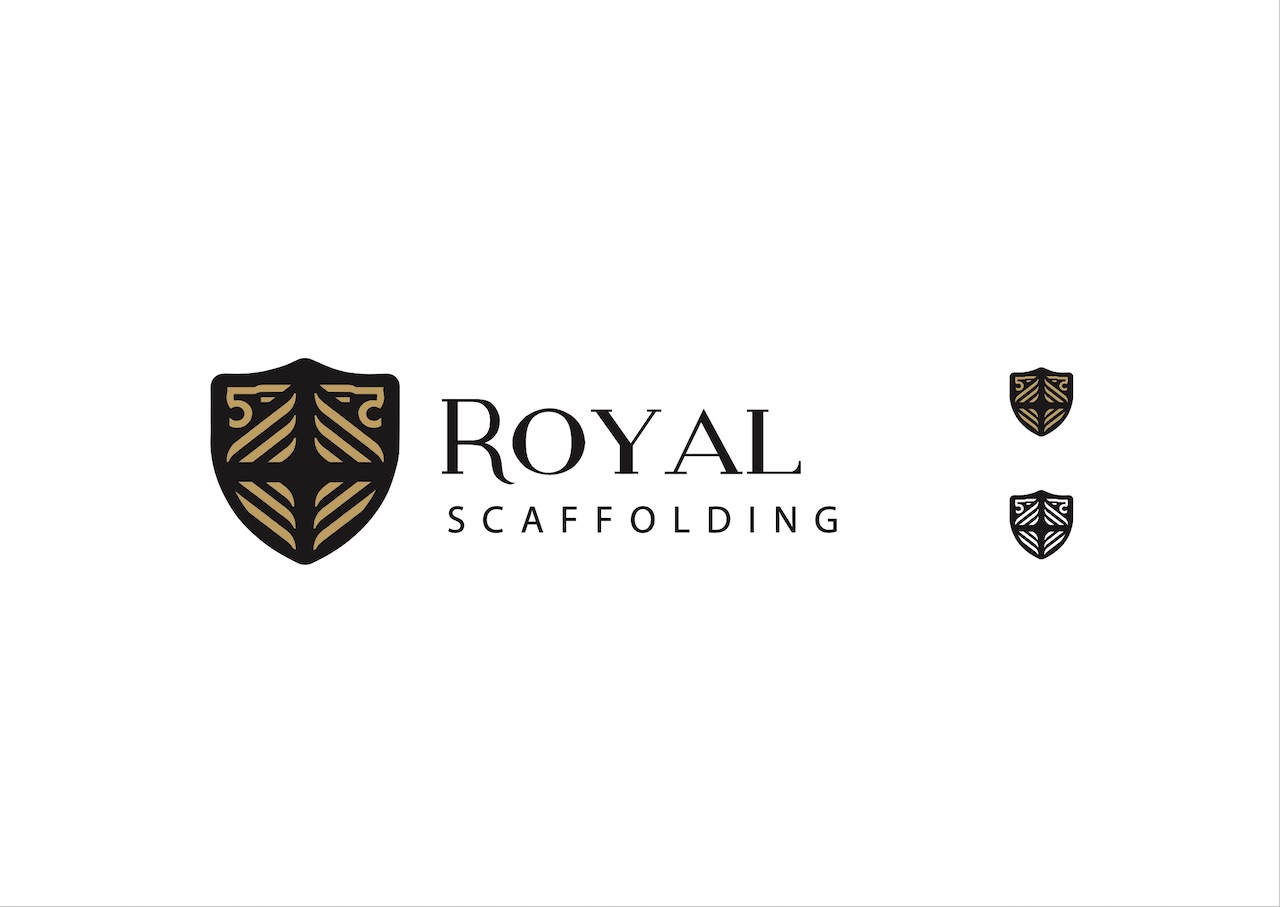
Two Lions – Concept 3
BRITISH/COURAGE
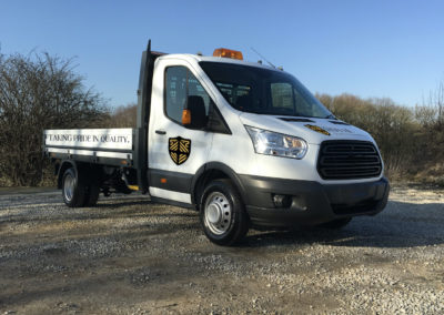
Depicted within the shield there are two lions, representing the founders of the company, three lions is a well known British symbol, coming from the Great Seal of King Richard-I which initially displayed two lions until 1198.
The shield shape the lions are housed in reference to a family crests which with 4 sections and across in the negative space. This has been set in a slab serif called “modern serif,” in-line with the logo it is contemporary, evoking the idea of high-quality craftsmanship of a tradition within the constriction industry.


