Rodwell’s Window Cleaning Logo


Signature Swoosh – Concept 1
Personal / Traditional
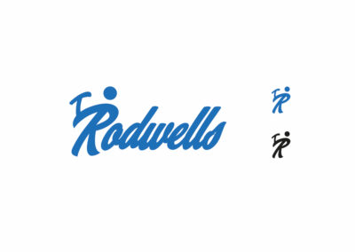
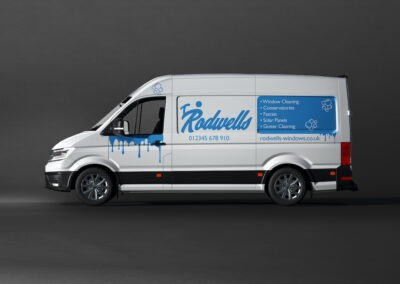
Using a small circle over the top of the “R,” makes the character appear like a stickman. The decorative swoosh that extends to the left is the character forms an arm which feather features a Squeegee has been placed in the stick man hands that matches the style of the script typeface. The logo here is a logotype that has been done in a script typeface that replicates brush handwriting.
When coupled with a family name this creates a personal feeling. Brush script like this one (“wannabees”) were more commonplace back when hand sign painting was more common in 1800-1950, this provides a traditional look. This logotype can be reduced to just the capital R (stick man) and still be recognizable as a symbol, this would be appropriate to embroid on a shirt or display as the icon on social media. Blue is a trustworthy color (many banks use this color) and is also synonymous with the window cleaning industry for its water connotation.
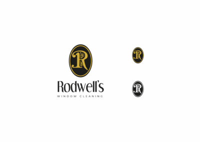
Old Timey Oval – Concept 2
Traditional/High-Quality
I have explored this by developing a black letter monogram that includes an ornamental art nouveau “R” This is illustrated in gold and black to give a luxurious, high- end, regal feeling/look.
That elegant font has become a condensed humanist typeface along with the most refined letter.
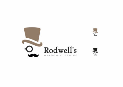
Gentlemanly Top Hat- Concept 3
Traditional English/Fun
The top hat, monocle, and mustache combination provide a Victorian-style whilst being displaying a sense of humor, also leverages the personal feel as the logo displays a person.
The gold coloring plays into the Victorian part of the identity, displaying that the service is high quality. The typography is a serif typeface called “Chelsea’ which provides a Victorian feel. This has been contrasted with a more modern sans serif typeface called “Monserrat” which features better legibility and a more modern feel to display “window cleaning” additionally the type has been tracked outwards to provide a luxury feel.


