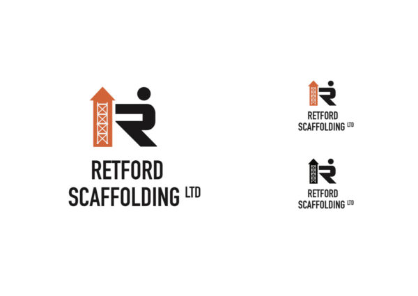

Arrow Man – CONCEPT 1
Arrow motif houses 4 levels of scaffolding. Orange was selected due to its use in the construction industry, as well as being a bold eye-catching colour. Circle used to form simple stick man, who is interacting with the arrow and4 stages of scaffolding. Bold sans serif all caps typography, synonymous with construction making a highly legible title. “LTD“ has been reduced to superscripts.”
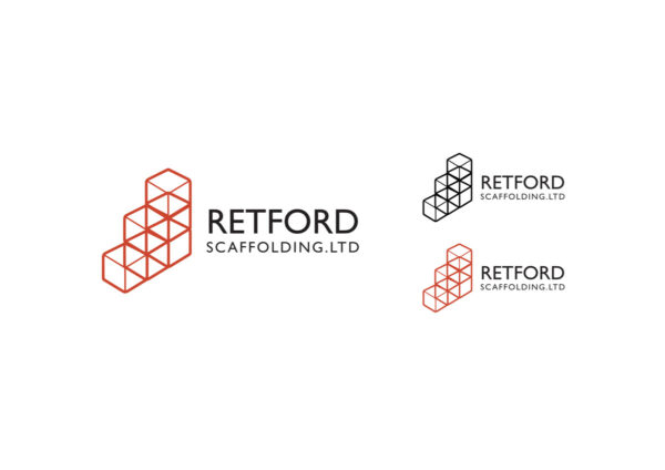
Cubey – CONCEPT 2
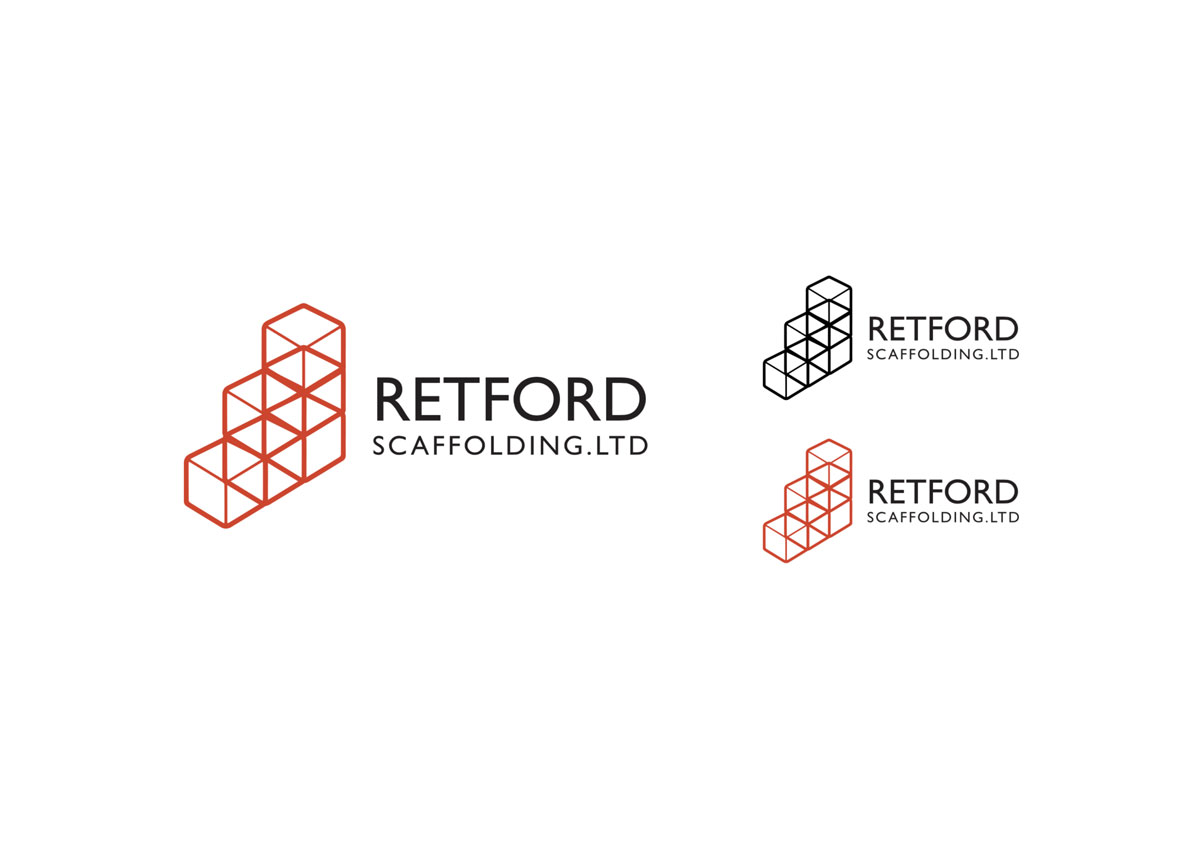
Outline of 3d cubes arrange to be 3 progressive steps rising upwards. Orange was selected due to its use in the construction industry, as well as being a bold eye-catching colour. Simple abstract form, bold sans serif all caps typography, this typeface synonymous the UK, used in street signs etc.


