PicNic Website
WEBSITE Features
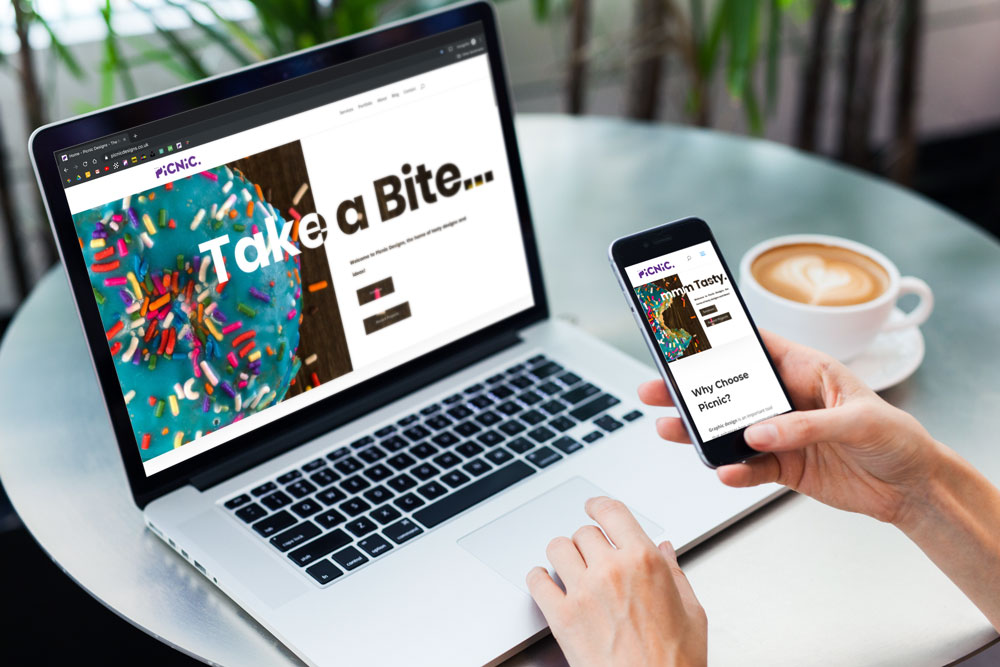
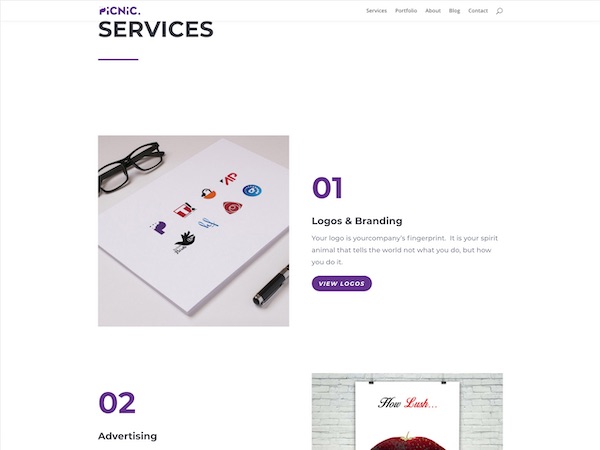
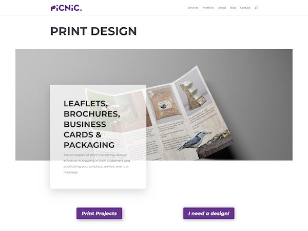
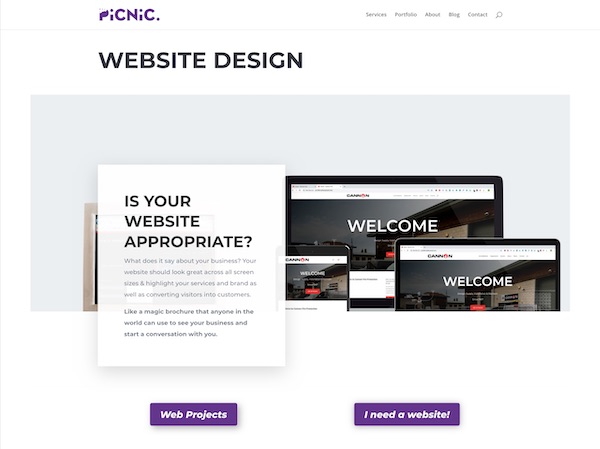
I wanted to replace my old portfolio website, as it wasn’t 100% fit for purpose anymore. Originally when I needed a website, I just wanted a portfolio site housing all the projects I had worked on through my design career. The new website feature a services page, that showcase all the things I can do for a client (Logos & Branding, Print, Websites, Advertising, Photo-Editing & Posters).
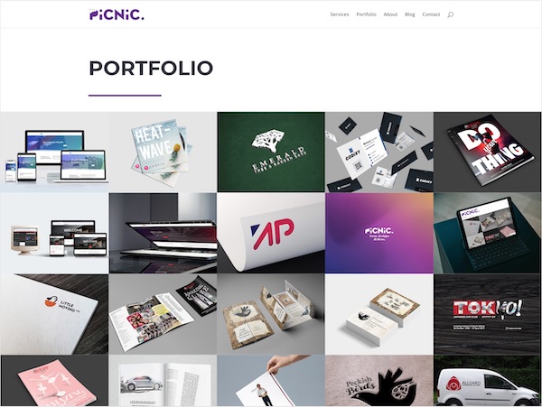
Additionally, there is the new blog page where I can discuss different topics, such as different aspects of logo design and the importance of high res images. There is also a dedicated portfolio page which largely serves the function of the old website, showcasing different design projects.
There is also a contact page and form so people can now use the website to get in touch with me and start new projects.
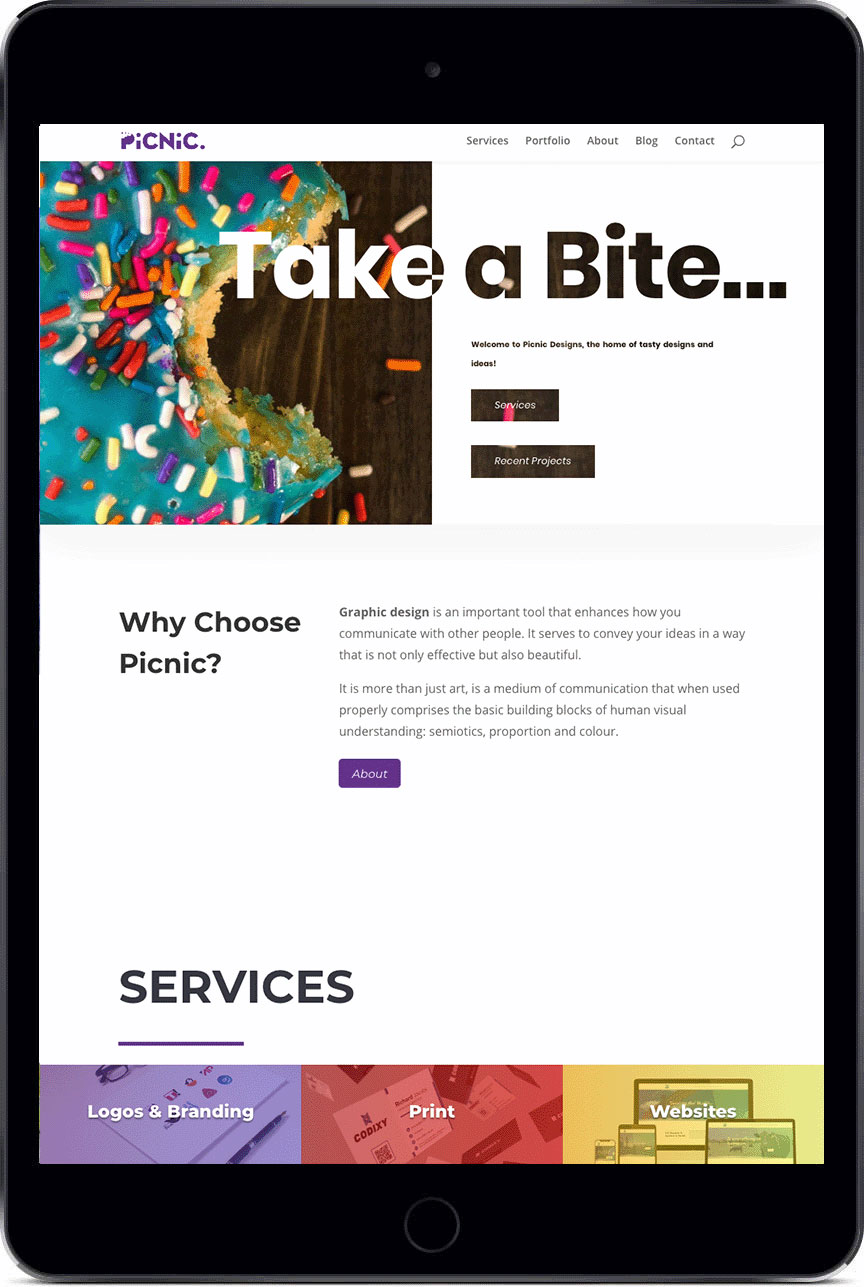
Responsive Design
User Experience Improved
These new features make this site more functional as it enables prospective clients a way of contacting me. Additionally, the new site has more some more technical features that give a more professional feel, including the domain and site-load-speed. I purchased the domain “picnicdesigns.co.uk” I also got email addresses with this purchase enabling me to send emails from the same domain as my website, this is important when leasing with clients over an email it adds a level of consistency to communications.
The new website is built with WordPress again but is not hosted on their servers making the site load faster, additionally, it uses a more modern page engine that has better compatibility with modern mobile devices.
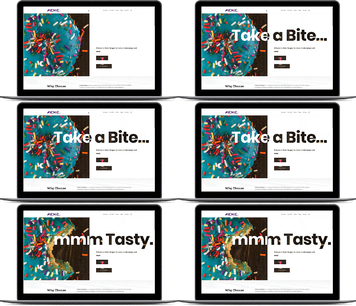
The new site has a lot more functionality and looks better than the new website.

Old website
The old website was part of my personal rebrand, I wanted to put together a portfolio site for my projects. Giving me a resource outside of social media to point people towards for the work that I do. I really wanted the site to highlight the work and look great across all screen sizes, whether you are on mobile, tablet or Desktop. The site is fully responsive and showing 1 column on mobile, 2 on tablets & 3 columns of work on a full desktop browser.
You can see the old website by clicking this link, I have left it live as is a good example of a website that can be made with no monetary investment. (the site often only loaded the header on first attempt, so if you want to see it… you’ll have to refresh a few time…fortunately, the new website is much better!)


