Picnic Web Revamp
Website Features
Mobile-First Design
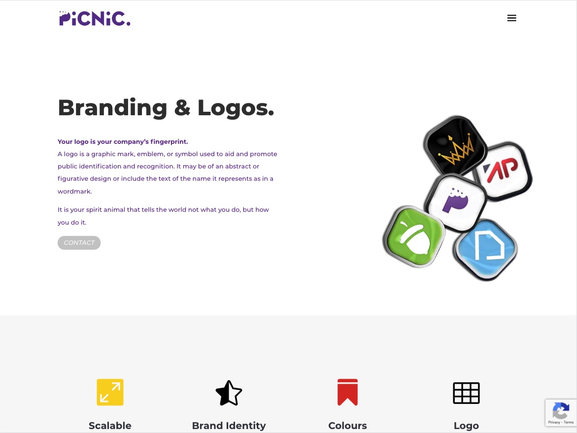
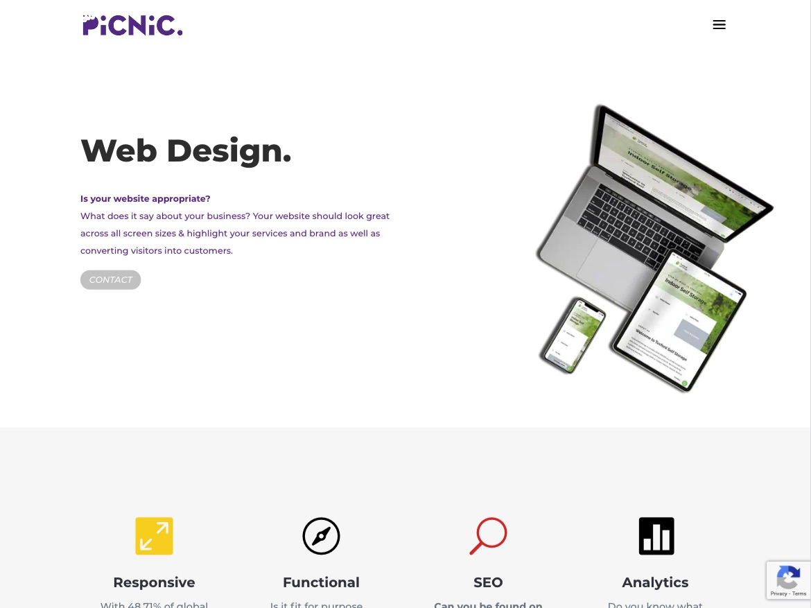
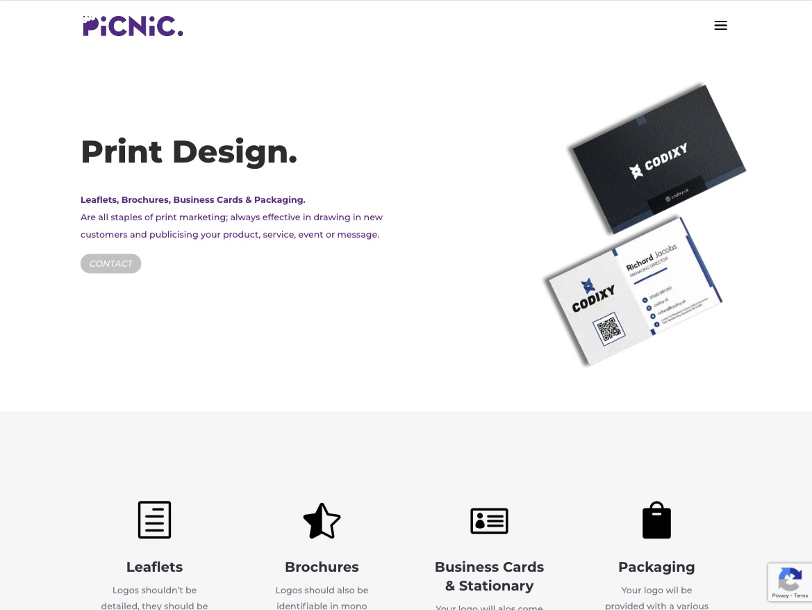
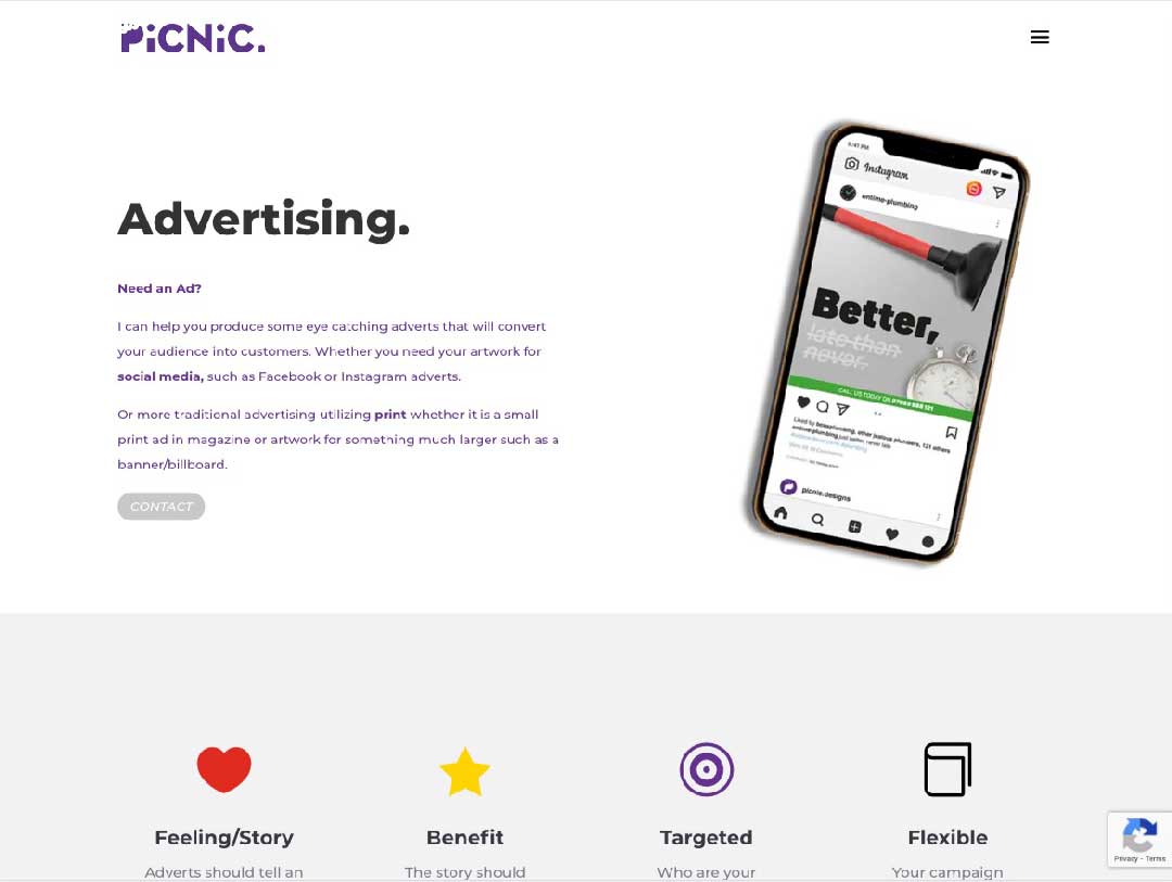
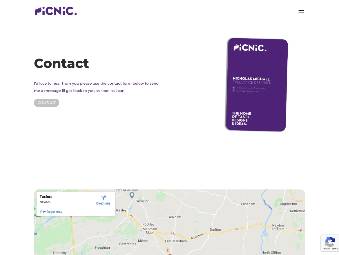
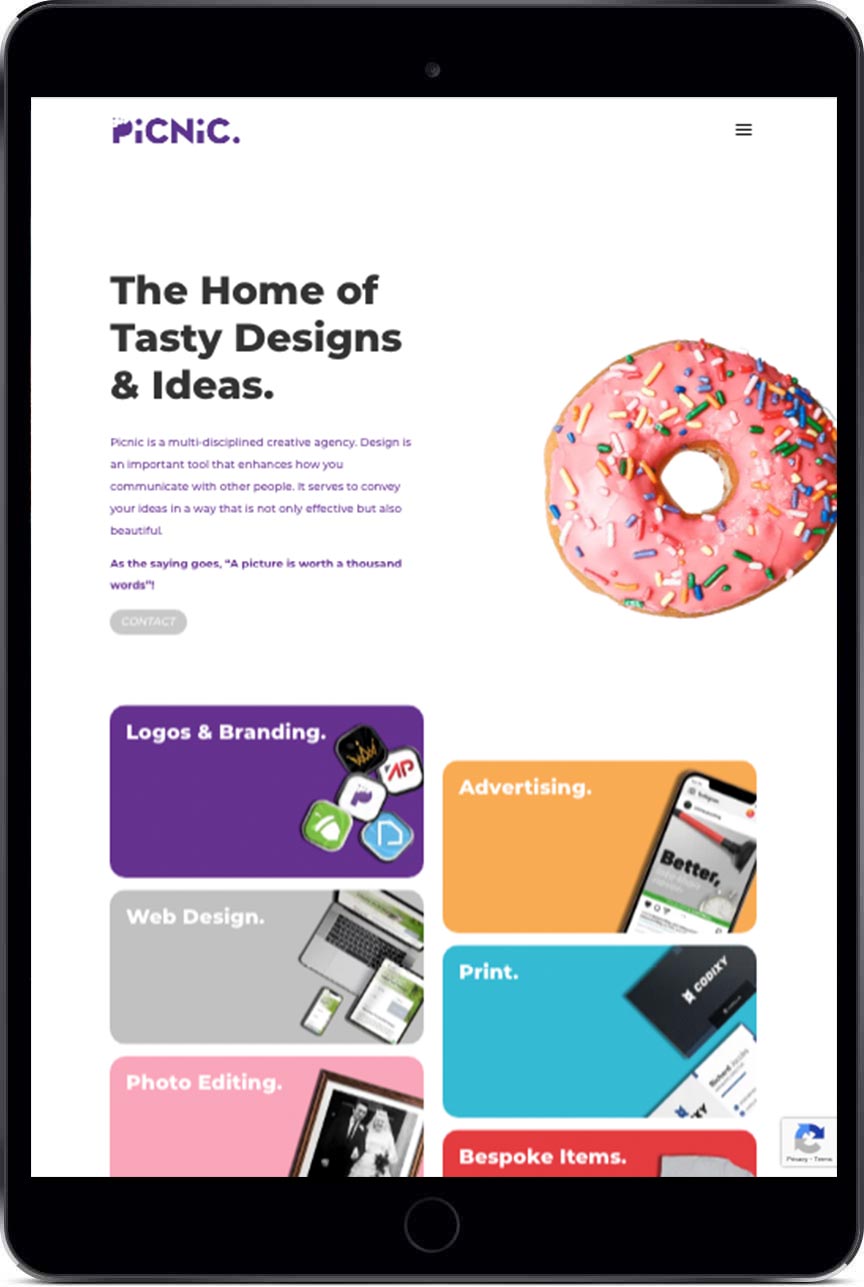
I came up with a new layout for pages and wanted to optimize the layout for mobile & making the site more modern and more “app-like” in its visual appearance. I did away with the traditional header image, which allows for more white space ensuring the user is more focused on the content that is on screen. There is still a “header image,” but with mobile optimizations such as lazy loading and WEBp image formatting, allows the text content to load first and then and load supplementary images when the user scrolls down. The new hero image on pages has had mild scroll effects applied to them, meaning that when the user scrolls the header image moves & rotates dynamically as the users’ scrolls, making the page stickier & more visually appealing.
Branding Exploration
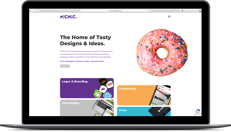
Additionally, the revamped website better explores the Picnic-Branding. Which is about providing a light and friendly design service. Using both imagery and copy-writing everything has been made to be tastier than before. The new layout is clean and the hero image (e.g. donut on the home) is set in white space. With a minor scroll effect which, stands out making the images used more memorable as a result. Copy on the website has been made “sweeter” too, for example on the about page there is values section which is a staple of modern about pages, has been revised to better suit the picnic brand, the heading now reads “Ingredients & Values,” making the section less generic and more suitable for the Picnic brand.
Simplified Navigation Structure / New Menu
Across the website, the navigation has also been simplified to now only include top-level pages. Previously it was all the top-level pages & list of services. The new menu is simpler as it doesn’t overwhelm the user with various categories and options and instead encourages them to explore the top-level pages, whilst offering the same functionality in the footer. The design of the menu has been refreshed as well, which is now much cleaner featuring a white background. This visually incorporates the menu into the website more.
Improved Footer – The old website didn’t offer much navigation in the footer just the picnic logo and links to relevant social media channels. The new footer features all the staples of a footer such as including links to policies. As well as offering more navigational links than the main menu, They have been divided into two sections, services & useful links. Additionally, the links have a small hover effect, highlighting to the user what they are hovering on / clicking on, is a small touch but emblematic of the work provided by Picnic.
Better Suited to Additions to Website – The Picnic website grew to offer news services such as bespoke items & new sections such as the shop, the new layout incorporates these from the ground-up by referencing the new sections across the website more frequently, for example, they are both featured in the new footer. Additionally, the new website design is more flexible, with a clear design language that will allow it to grow and adapt to new pages and sections.
Improved About Page – The new about page features more information and new sections such as Values & “Brands-we-have-worked-with” as well as other staple information found on other such pages. This new version of the about page is much more professional and provides more information for the reader. Finally, the about page features a small reference to the hidden easter egg section. This new section features a secret challenge, find all the eggs and the codes to unlock a secret on the website.
