Packaging for The Terp Shack Project
Flavoured Broad Spectrum CBD Oil
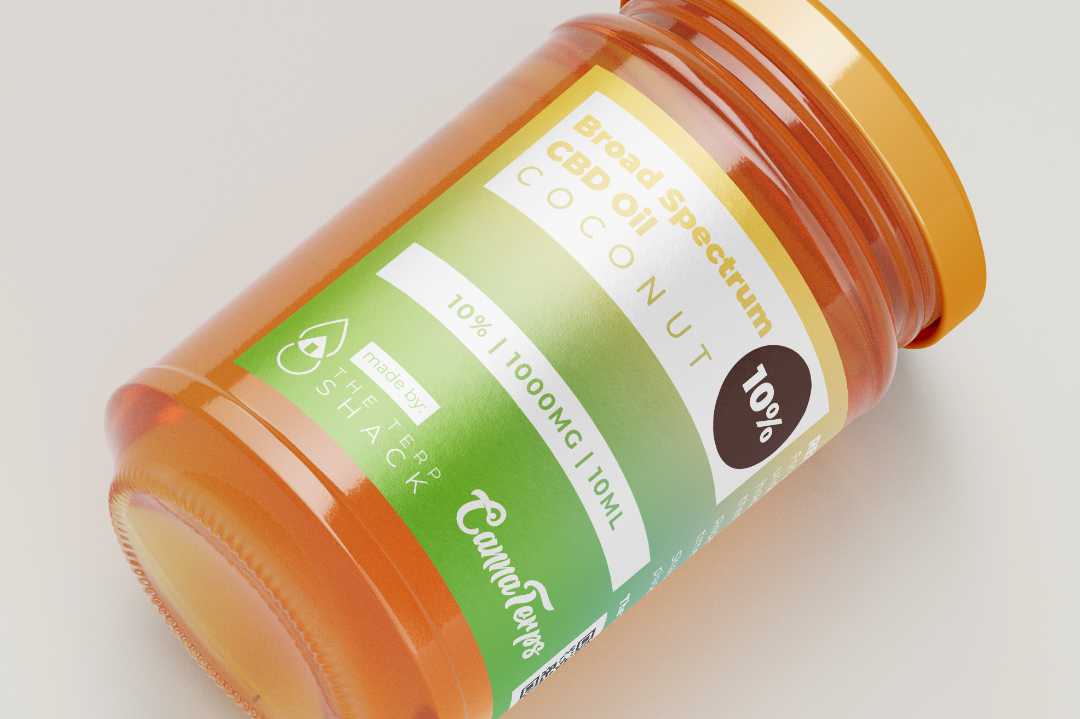
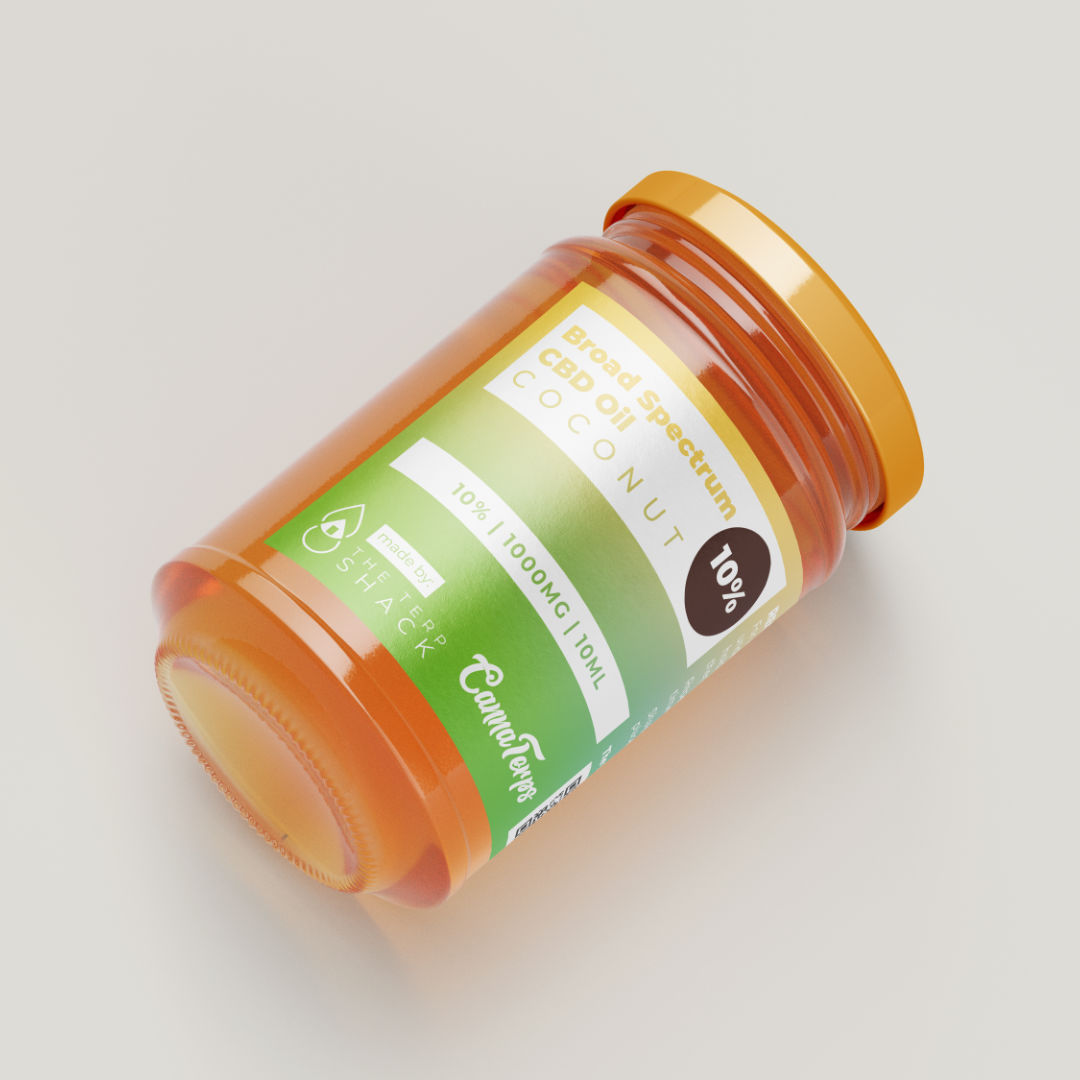
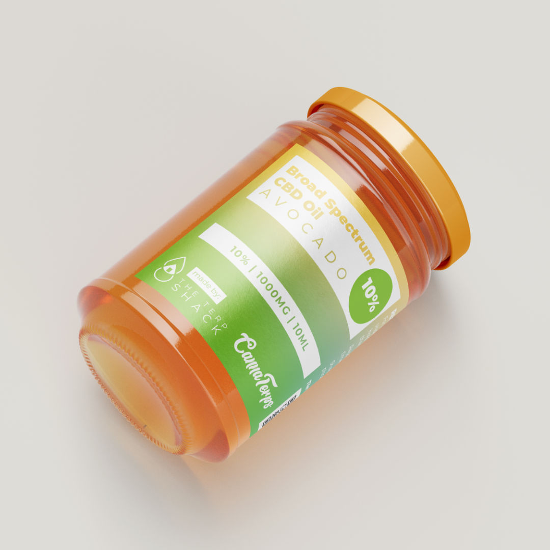
As these two products were similar to each other the key distinction between the two is that one is coconut flavour and the other is avocado flavour. To illustrate this the coconut CBD percentage of the products is coloured brown and the avocado is green. Additionally, these products had variants varying in strength for both the coconut and the avocado including from 10%, 20% & 40%.
Balm Packaging Design
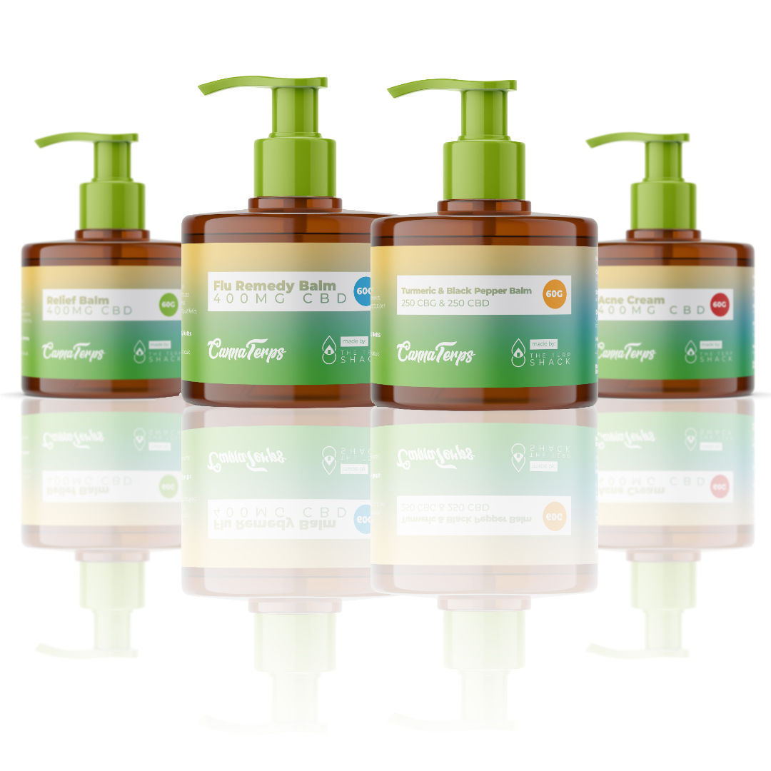
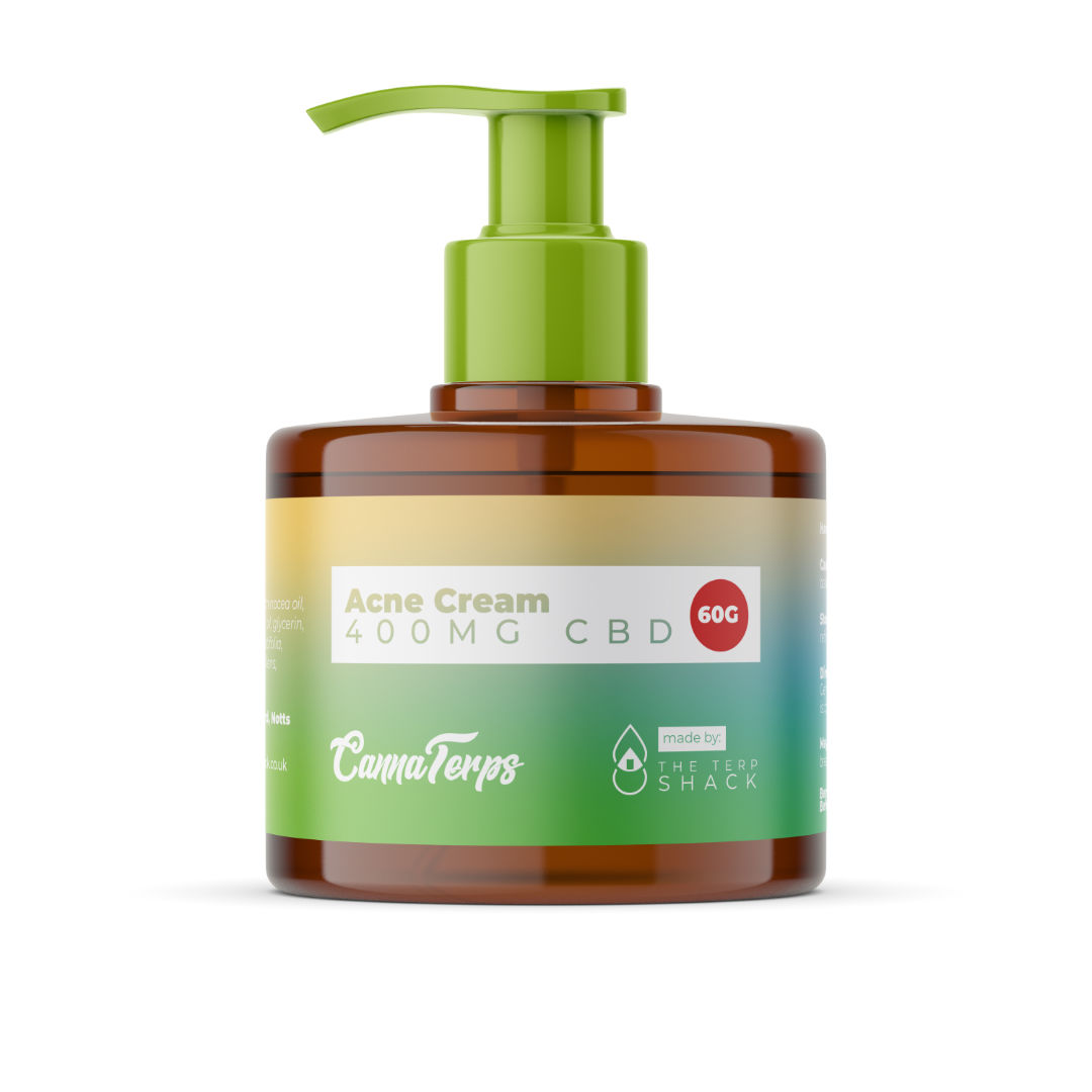
These 4 balms offer different health benefits but as they were all from the same line we produced a similar layout to illustrate that these products were from the same family of products. The designs feature mono-white logos allowing the user to focus on the variant of the product that they are looking at. The background features The Terp Shack brand colors/gradients on the background to communicate that the is one of their key products. The text is cut out of a black text box this would go on to be a design cue that unites all the designs and Terp shack products.
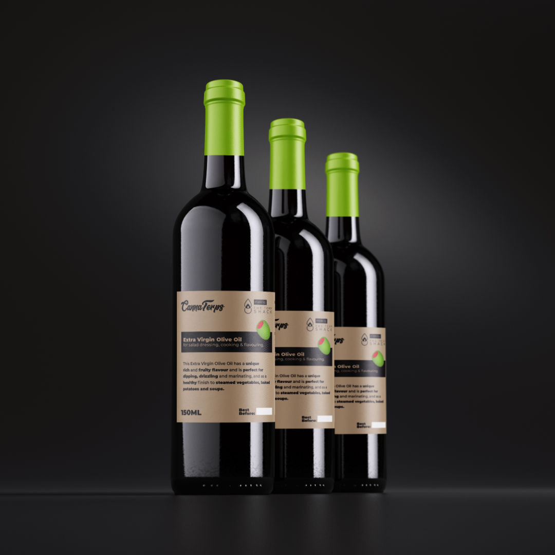
CBD Olive Oil
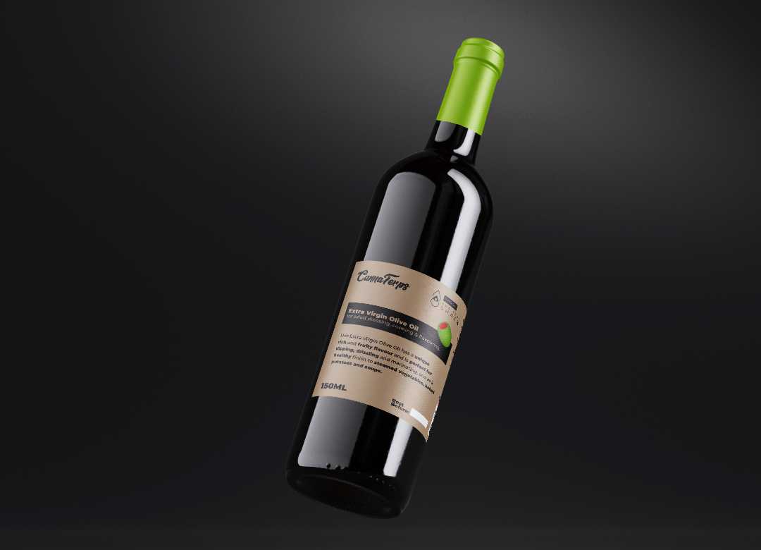
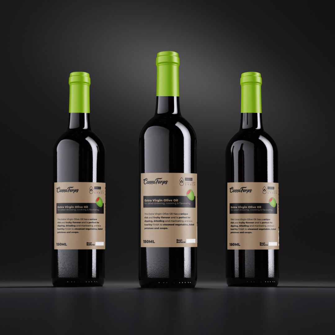
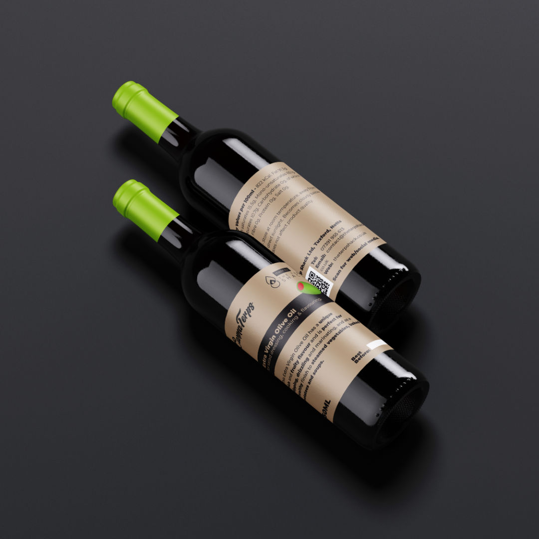
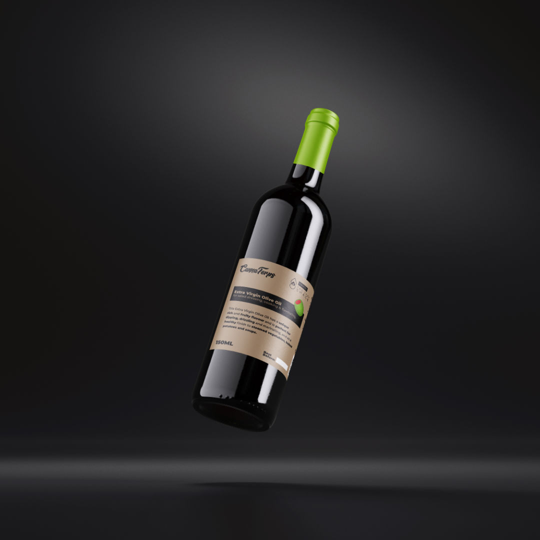
For the CBD we opted to focus on the raw and natural elements of the product & implementing them into the design. By using a brown background emulating un-bleached paper. Customers that are in the health market will see this color as unbleached paper and will assume it features the benefits of Unbleached parchment is 100% biodegradable, making it the most environmentally-friendly option. Additionally, when in comparison to the rest of the product range the color when compared to the other products tells consumers that this is an ingredient.
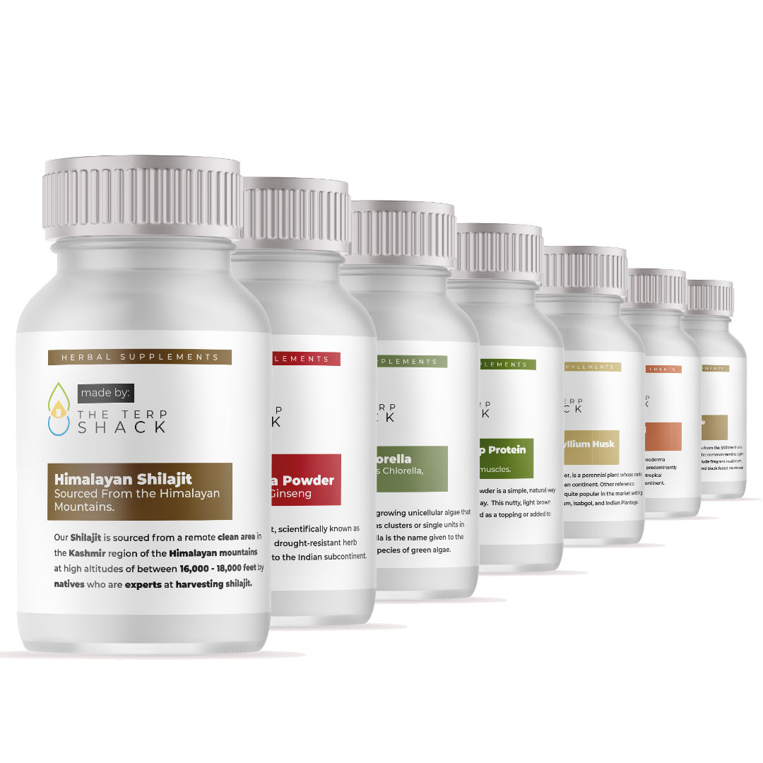
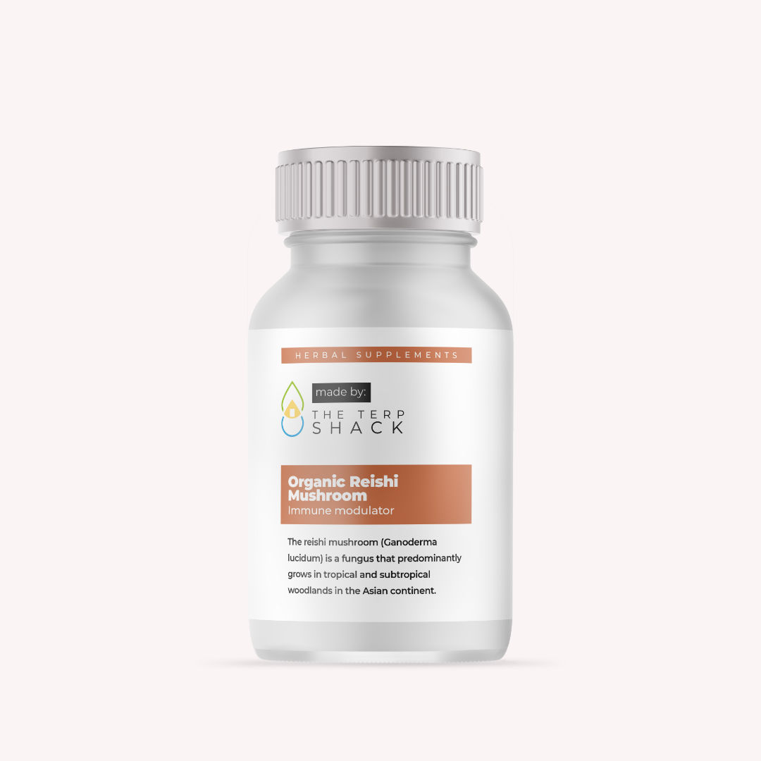
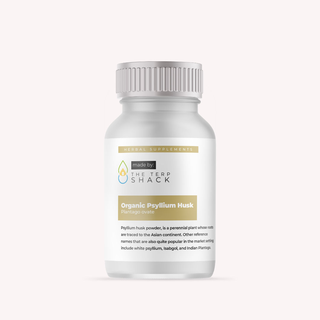
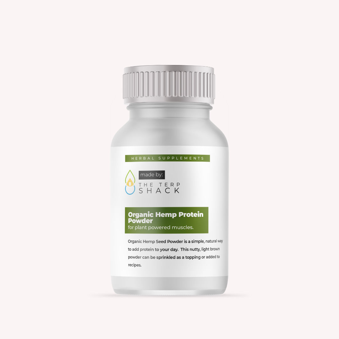
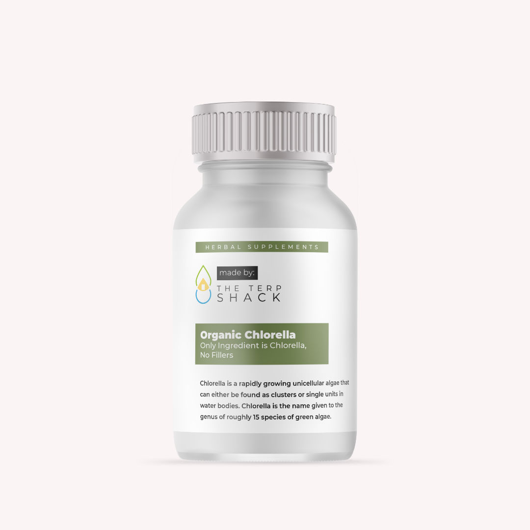
Herbal Supplements
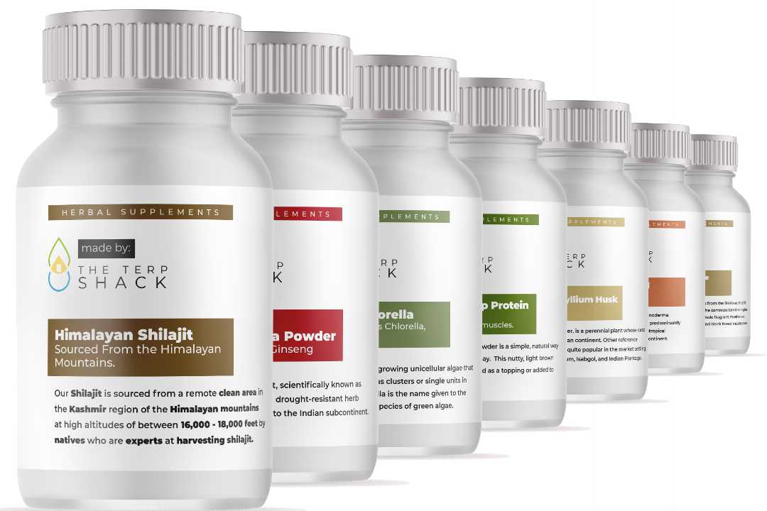
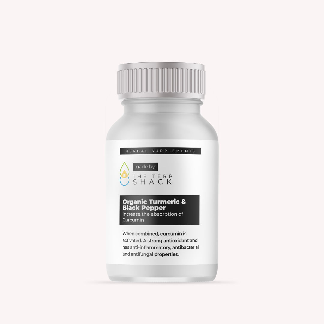
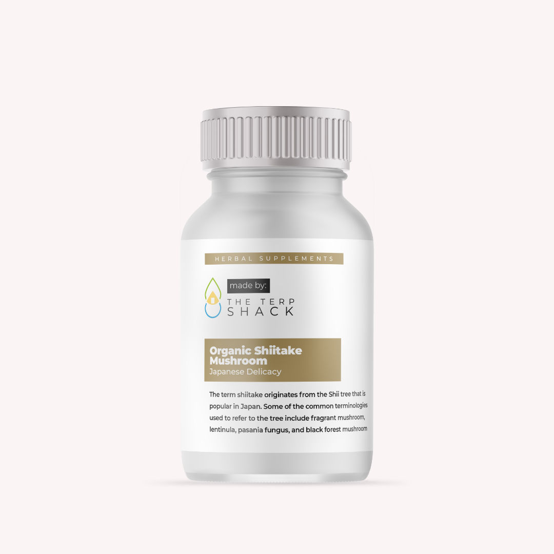
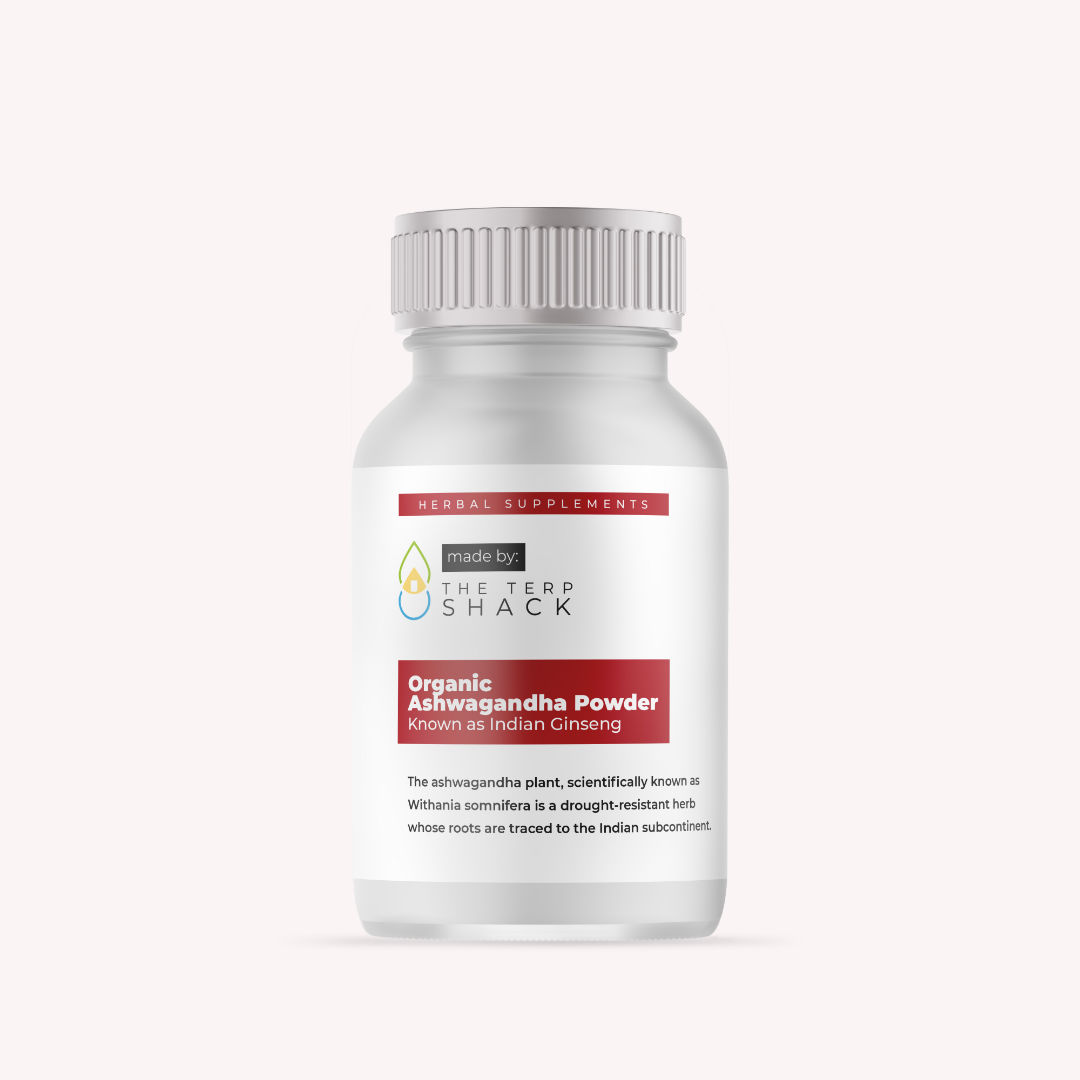
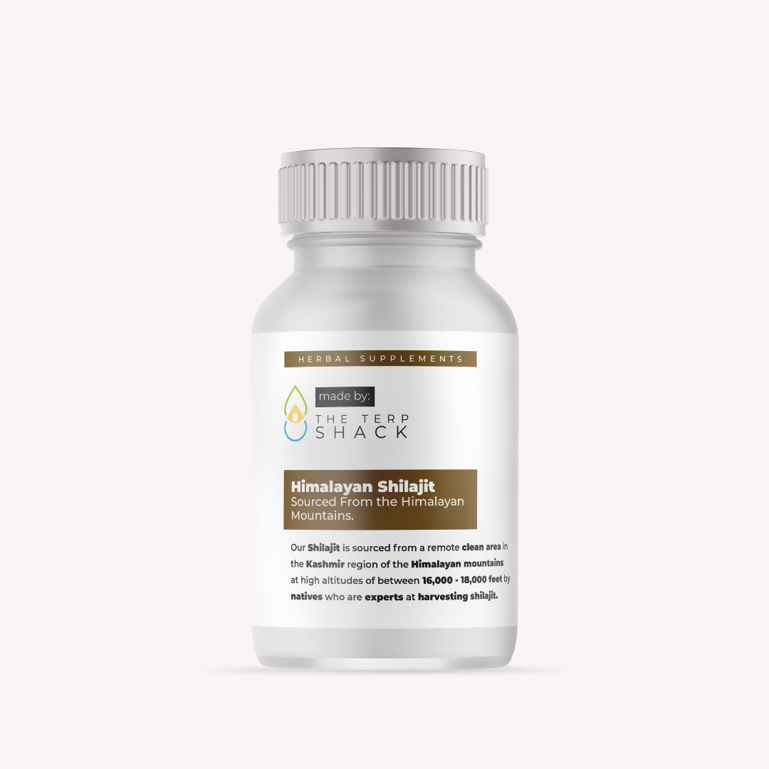
For the herbal supplements we wanted to distinguish this product range from everything else, we did this by using a white background whilst incorporating the various design cues established on all the other packaging. Such as the typography used throughout the range and the boxed title product which help the consumer immediately identify what the product is. Across the range, the title box & product category (featured at the top of the bottle) changes colour reflecting the contents of the bottle. For example, the black pepper product has these sections coloured in black & the shijat is a brown, mirroring the colour of the powder. This range of colours communicated to a potential customer the broad range of the product.
Organic Honey .
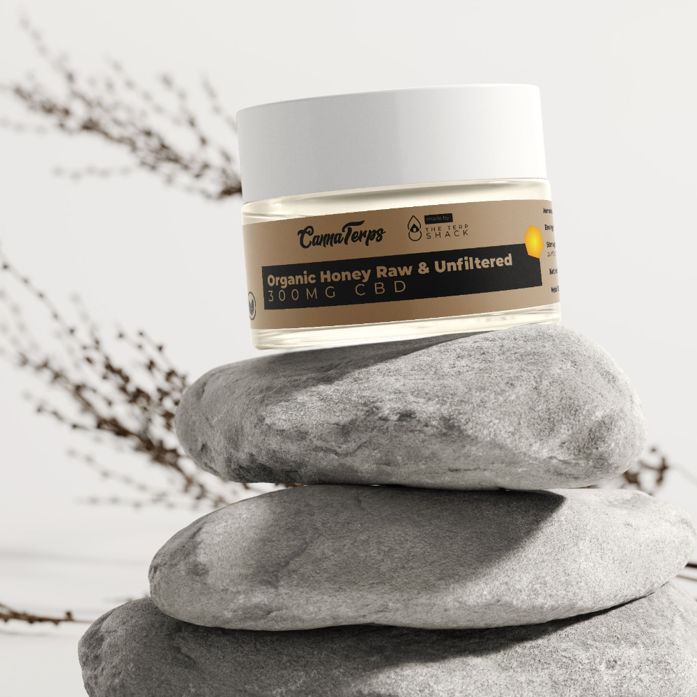
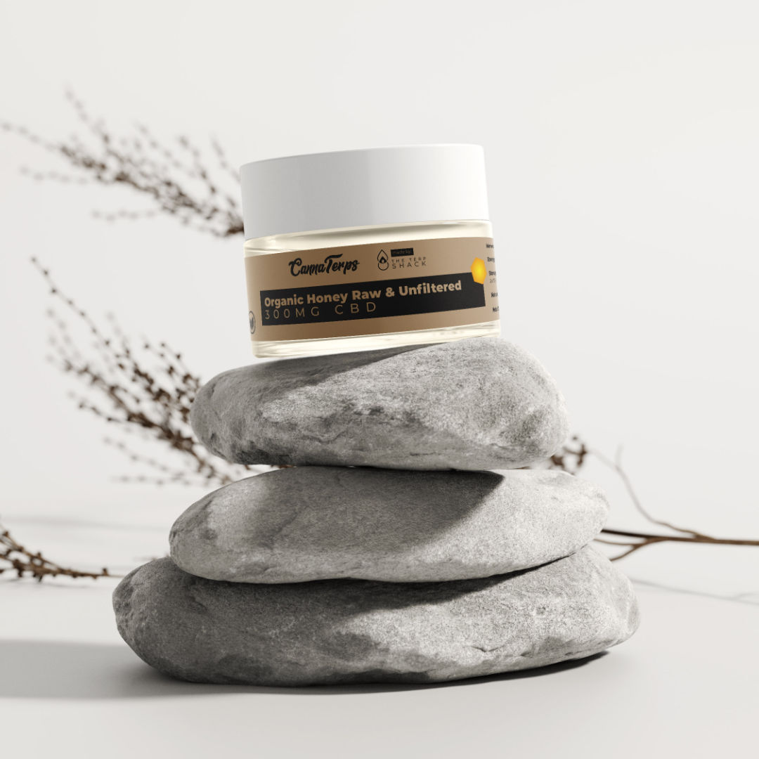
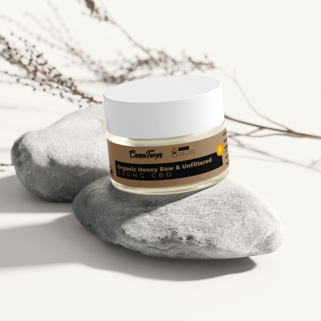
Similar to the Organic olive oil the background colour is pale brown reminiscent of more traditional packaging that used unbleached paper. This colour will be familiar to consumers who look for organic and healthy products. The colouring will draw in the correct consumers as this is in stark contrast to unhealthy which is often coloured with bright colours.
QR Code Across the range of products.
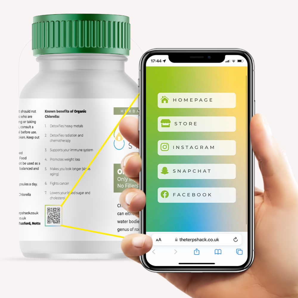
On the rear of all the products, there is a QR code that goes to a. “link-tree” style page which when scanned redirects the audience to a page where there are key links such as the shop, the homepage, and all the various social channels that The Terp Shack have.
