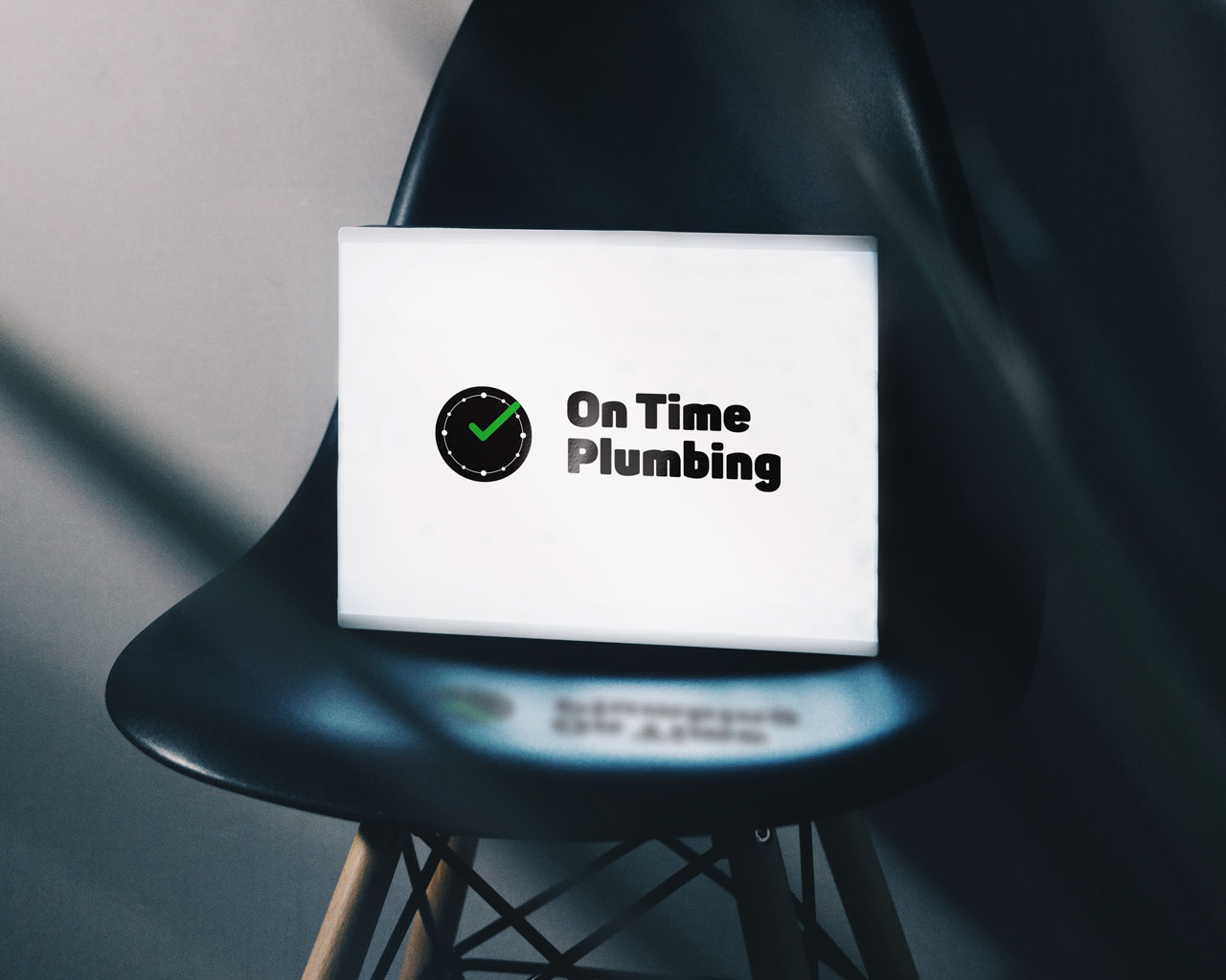
On-Time Plumbing Branding
Whats the brand? What is the idea?
Reliability is something highly desirable to someone in need of plumbing services.
Often clients will be stuck trying to think of a catchy or clever name that won’t be understood by the audience, your customers may not understand industry in-jokes or puns.

Scalability & Colour
Logos shouldn’t be detailed, they should be simple and iconic. Which lends itself to scalability it must work at both 1 meter wide and 1 centimeter as well.
Logos should also be identifiable in mono formats all-black and/or all-white. This will provide flexibility for the logo to be used in different ways.
Logo Application
So once you have a logo you will need to start applying it to your service/product. This is why it is important your logo is scalable. You will want to apply it to different mediums such as fabrics, paper, so its best it is optimized for all these mediums, sometimes the medium won’t allow multiple colours. Or has to be a certain shape like a social media profile picture. The more detail it has the more it won’t be visible when seen.
Using the OnTime Plumbing example, the clock/tick design is simple and different from what is in the industry when applied to a van a customer would recognise the simple icon at distance. Later a customer would know the engineer knocking on the door was the correct tradesman as they would recognise the logo on the uniform and van.
ON-TIME VS BOB’S PLUMBING
To highlight the differences between good branding and bad branding. I applied the OnTime plumbing brand to an advert in which I develop the concept of reliability with a campaign, appropriately branded imagery.
I have contrasted this with another advert from another example company with poor branding.


