New APG Website
WEBSITE Features
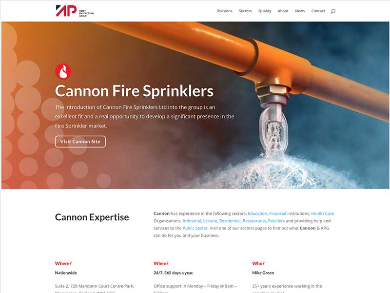
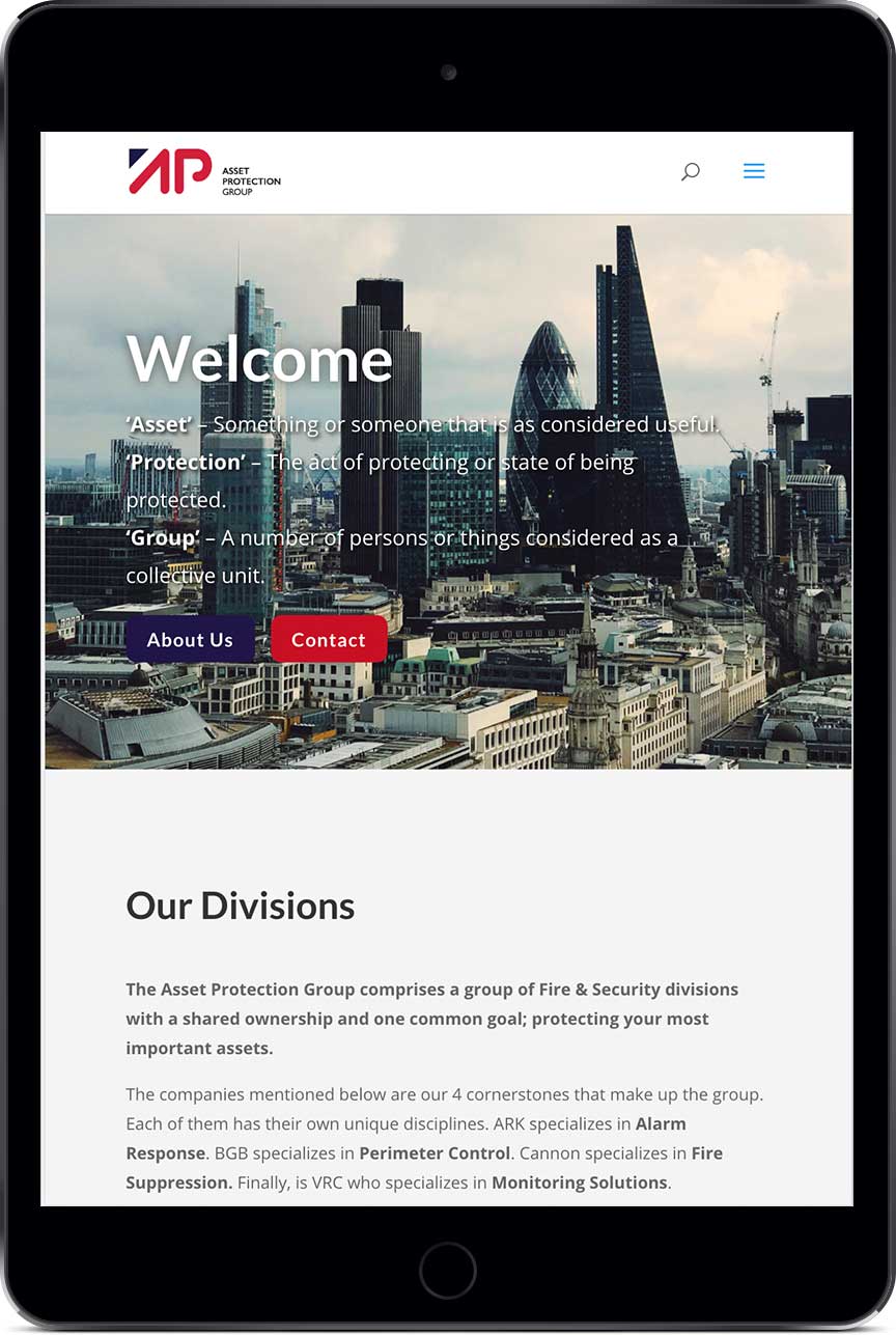
Giving employees across the group a resource that they can point customers towards, this gives us a new opportunity to highlight the benefits of companies in the group. The site is fully responsive, we wanted to make sure that the website looked great across all screen sizes, whether you are on mobile, tablet or desktop.
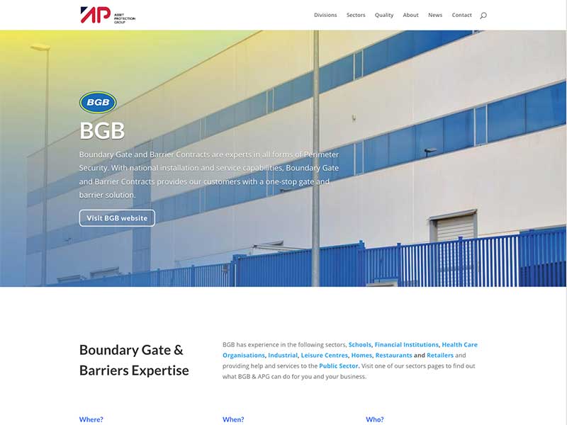
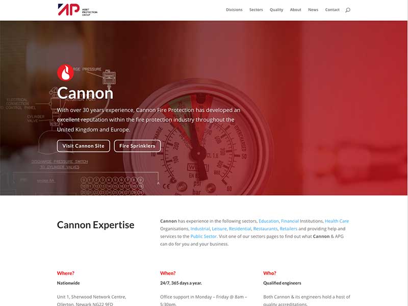
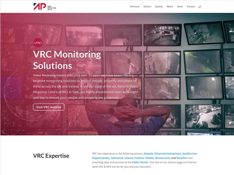
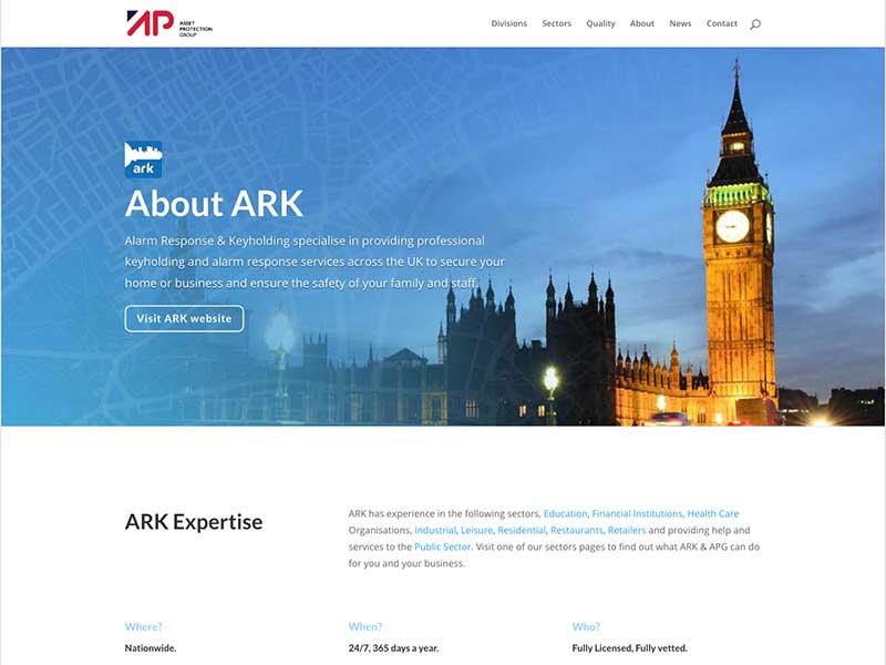
The new website has a division page that shows all companies in the group, ARK, BGB, Cannon & VRC. On these pages visitors can get to divisional websites, on top of this, we have our sectors pages which shows our areas of business.
We also have a webpage showing our accreditations, highlighting awards, accreditations and other quality marks held by the group. If you wish to know more about accreditation, click on it to visit the relevant page, which will tell you about the accreditation and the companies within the group that hold relevant accreditation.
We also have put together a newsletter webpage where visitors can subscribe to our monthly e-newsletter and once a month you will receive an email containing the best news from all across the APG group.
Minimal Design
Responsive Design
User Experience Improved
The new website improved legibility and hierarchy ensuring that users could see the page as well as find the page that they needed.
Branding elements
Graphical elements were created to compliment the new website these have since been adopted in print being used on business cards and other items.
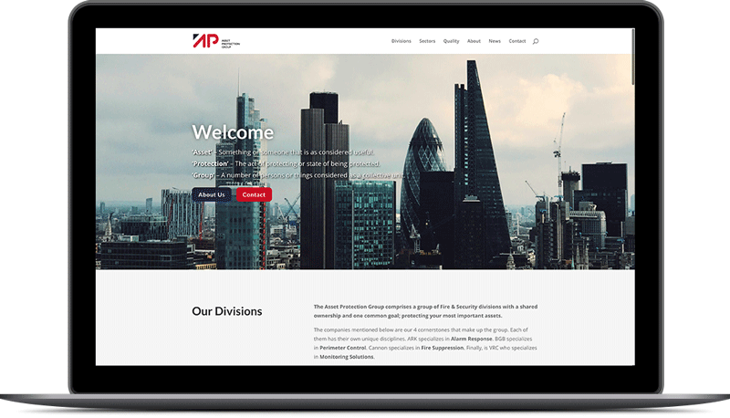
The new site is much more user-friendly.
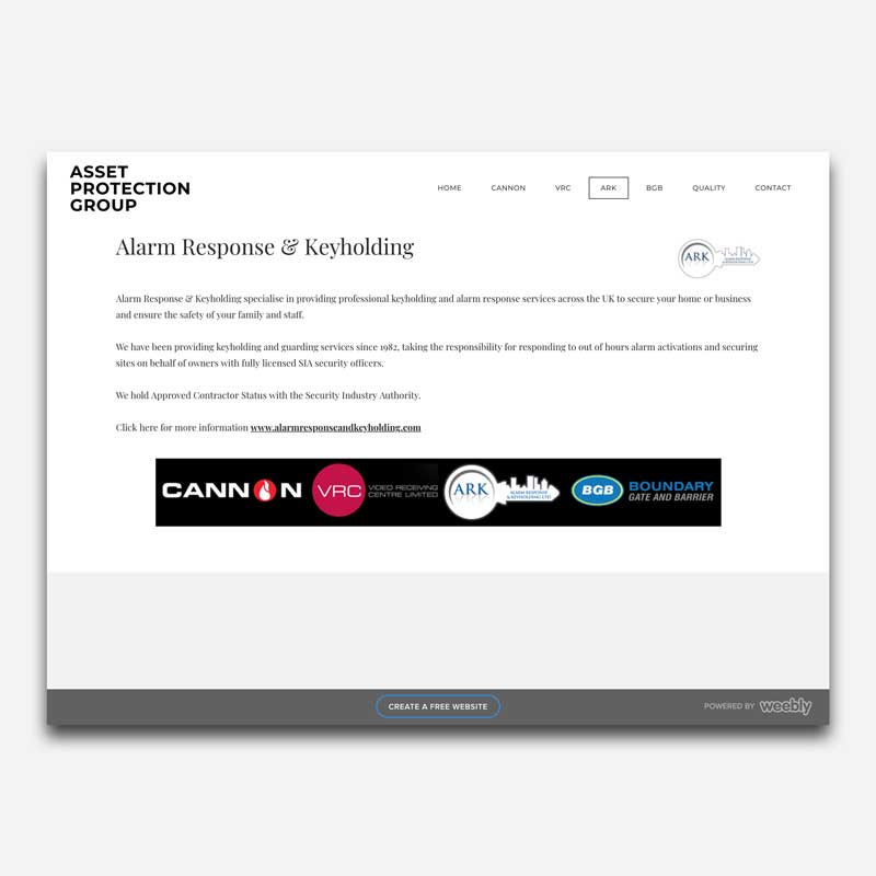
Old website
If it is hard to read then it is hard to sell. The old websites black background and small white text resulting in a very contrast webpage that difficult to read.
In addition, all page content was counter-intuitively forced into the bottom right corner of any given page.
As westerners we read from left to right, the previous website placed the contact form and twitter feed as the left-most objects making it, so these were seen first, this breaks the visual hierarchy,


