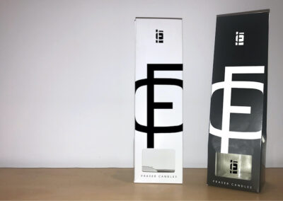
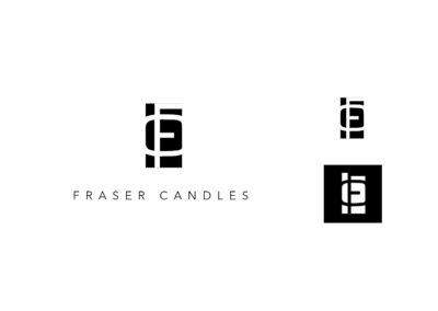
Fraser Candles Updated Logo

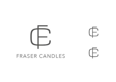
(original)
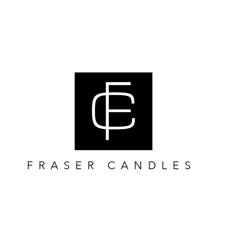
(Concept 1)
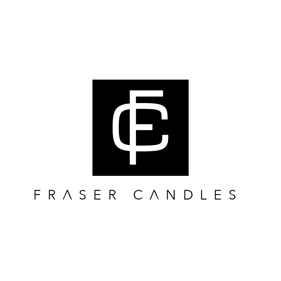
(Concept 2)

(Concept 3 – winner)
Boxed – Concept 1
MORE FUNCTION, MINIMAL CHANGES.
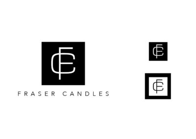
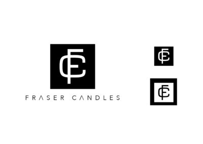
Using a 16-by-16 grid I housed the FC monogram in a black box, using the height of 2 rows (two-sixteenths) to balance the characters in the space.
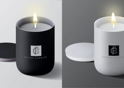
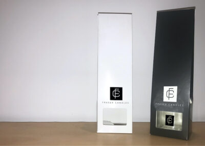
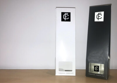
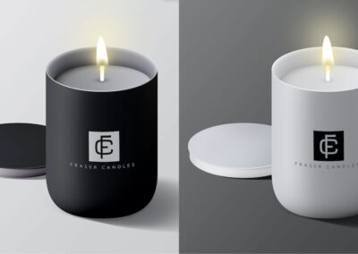
This new housing will give more contrast when applied to packaging, as the black square will contrast against a white background and the color of various perfumes and scents when applied to transparent packaging.
The tracking of Fraser candles has been increased, providing the brand name to make it look more luxurious, allowing the hierarchy of logo to focus more on the mark rather than the logotype.
Boxed & Bolder – Concept 2
EVEN MORE FUNCTION, MORE CHANGES.
The grid adherence has been increased on this concept, as well as making the character forms heavier. Meaning that when viewed from a distance or printed it will provide more contrast than the original and be more visible.
The “C” has been made smaller to accommodate for the increased weight and the “bar” of the “F” has been made smaller, allowing for better internal spacing.
In addition to the tracking, the logo-type has been altered removing the crossbar of the “A”, enhancing the luxury feeling and making the logotype more distinct.
Abstract – Concept 3
MOST DISTINCT, MOST FUNCTION.
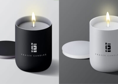
Adhering to the same 16-by-16 grid previously mentioned I brought the square in to overlap with the letterforms, this highlight the negative space within the monogram, this forms several geometric shapes that make a very distinct mark.
This combination of shapes is the most distinct and when coupled with the grid optimization makes this the most functional revision.


