DSOC Business Cards
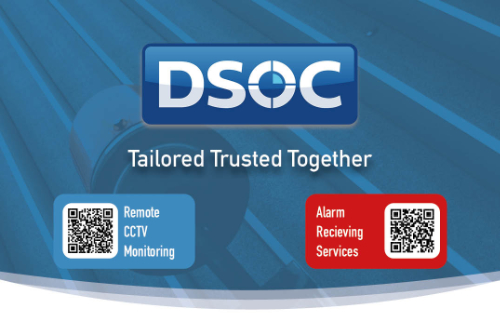
Concept 1
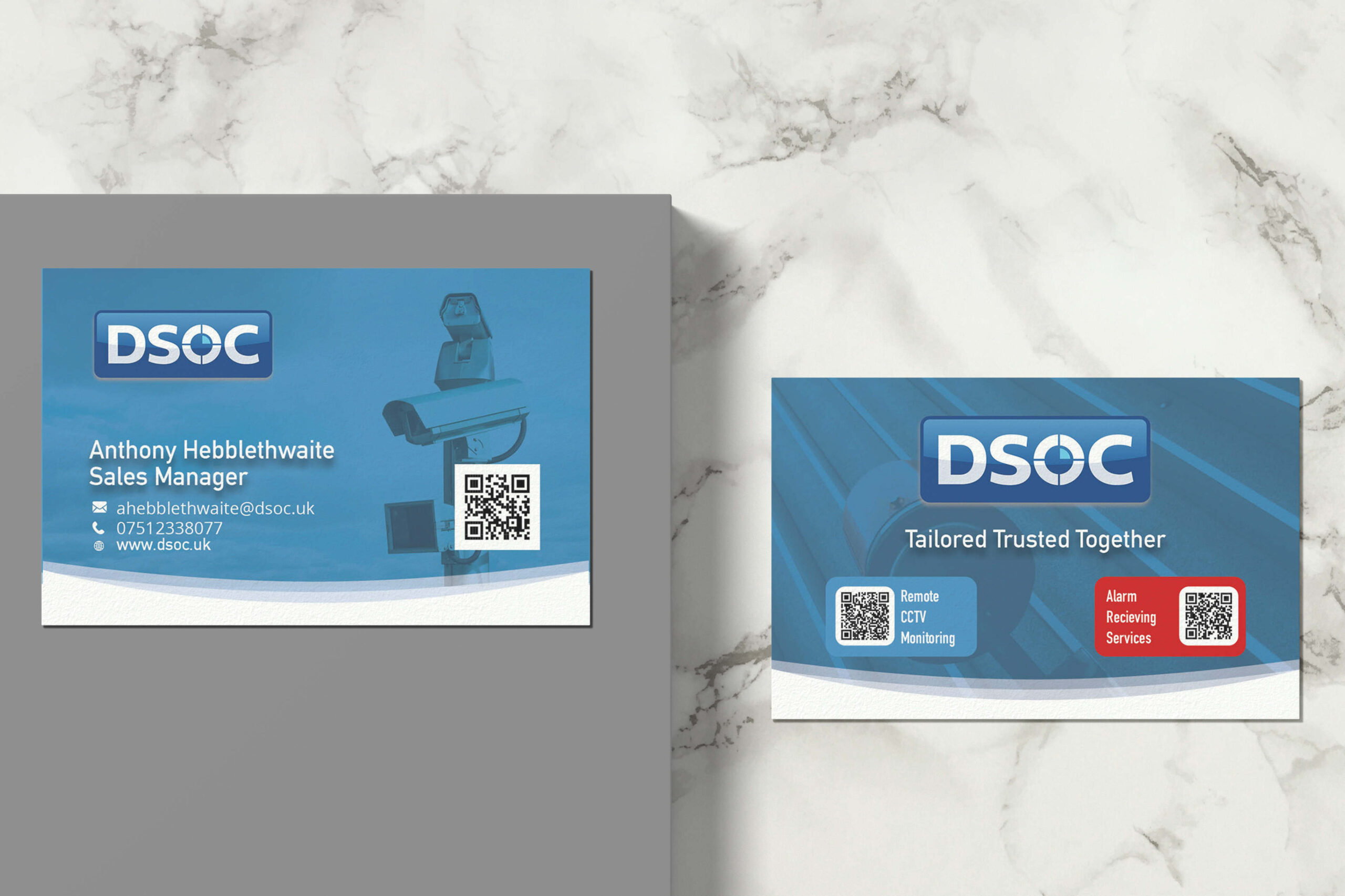
The first design shares visual cues/elements that can be found on various pieces of marketing material such as leaflets websites and other. It also features imagery used on the website to really make it feel like this card comes from DSOC and the two-match and portrays a coherent design language.
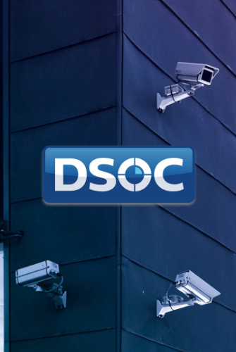
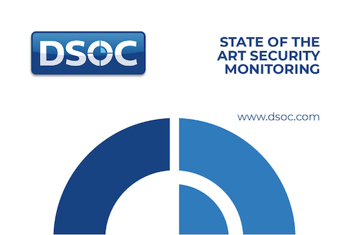
Concept 2
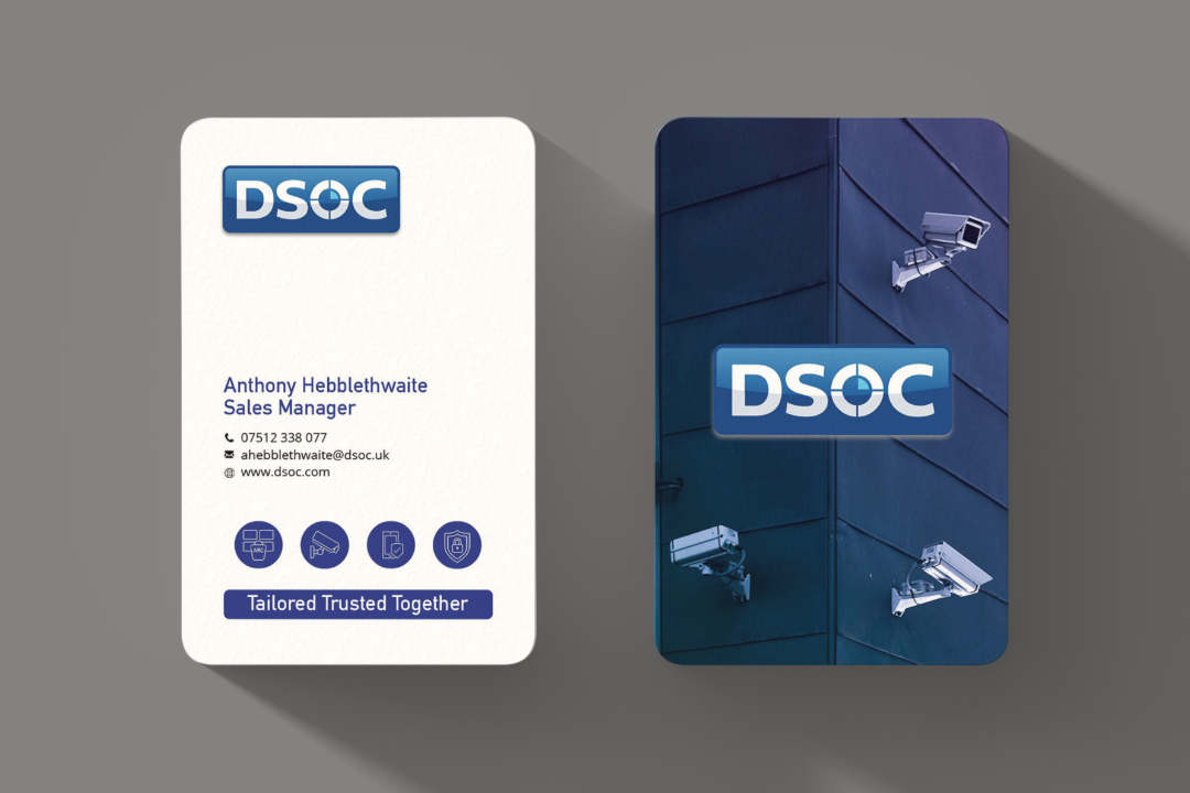
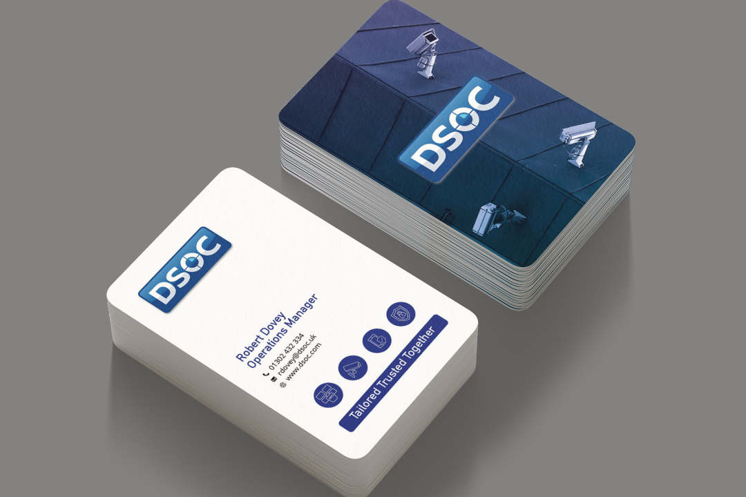
The second design is a little simpler but I feel it compensates and is cleaner and more distinct and a lot of companies OPT to landscape so the portrait is a little more surprising to the viewer when received. It also features a few icons on the face of the card highlighting some of DSOC services. The rear of the card is very clean with only the logo and duotone blue gradient image which has been used in the header of other DSOC material.


