Courio Software Logo
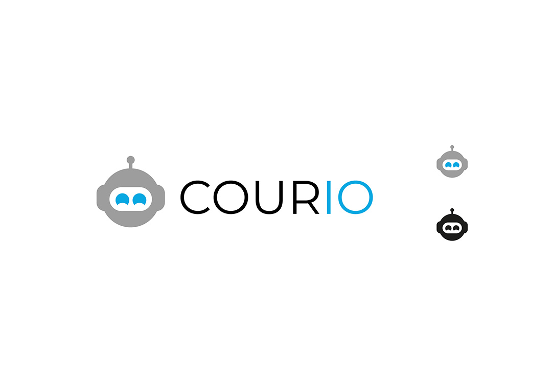
Simple Robo – Concept 1
Simple, Automated & Smart
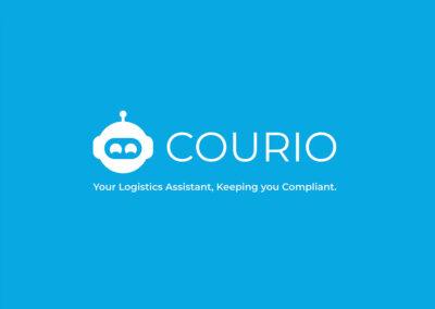
A simple design featuring a robots head, using the blue found in the original logo to light up the eyes. The blue colour is used by various businesses related to software, finance, the pharmaceutical industry, government, and banks, as it represents authority, loyalty, power, professionalism, and trust. Making Courio look well established and reliable.
The typography is set in all-caps as a balance to the light logo, additionally, the logotype features the final two letters in blue (IO) in blue, this further highlights this is a digital product as these two characters represent on & off.
The tagline that goes with this mark is “Your Logistics assistant, keeping you compliant,” so the robot is literally the customers assistant. The choice of the word “your” is also very purposeful as it makes the product/service more personal and seem more helpful.
Lightning Fast Robo – Concept 2
Fast, Automatic & Smart
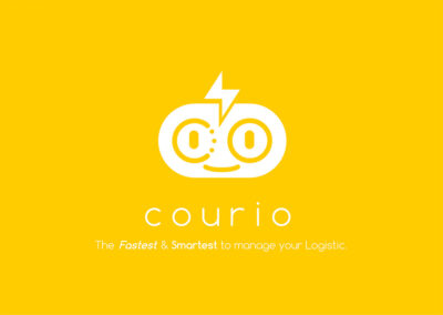
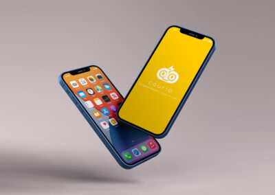
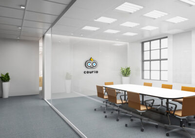
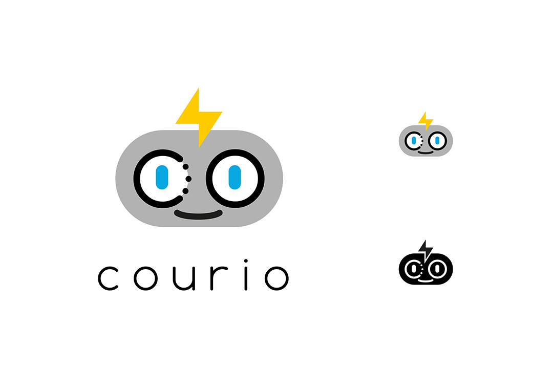
Similar to concept 1 this design features a robots head, this design features a smile making the assistant seem more friendly and less robotic.
This design does not feature an antenna instead uses a lightning bolt, this highlight the speed and power of the Courio service while the robot displays the automated element of the service. The first 2 letters “CO” of Courio have been incorporated into the robots face, with the character making up the eyes.
The typography has been set in lowercase, which matches the more friendly aesthetic of the mark and matching the smile on the robot’s face.
Simple Switch – Concept 3
Easy, Modern & Smart
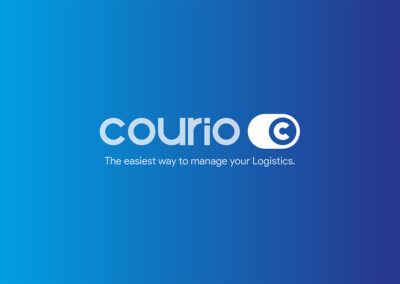
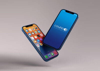
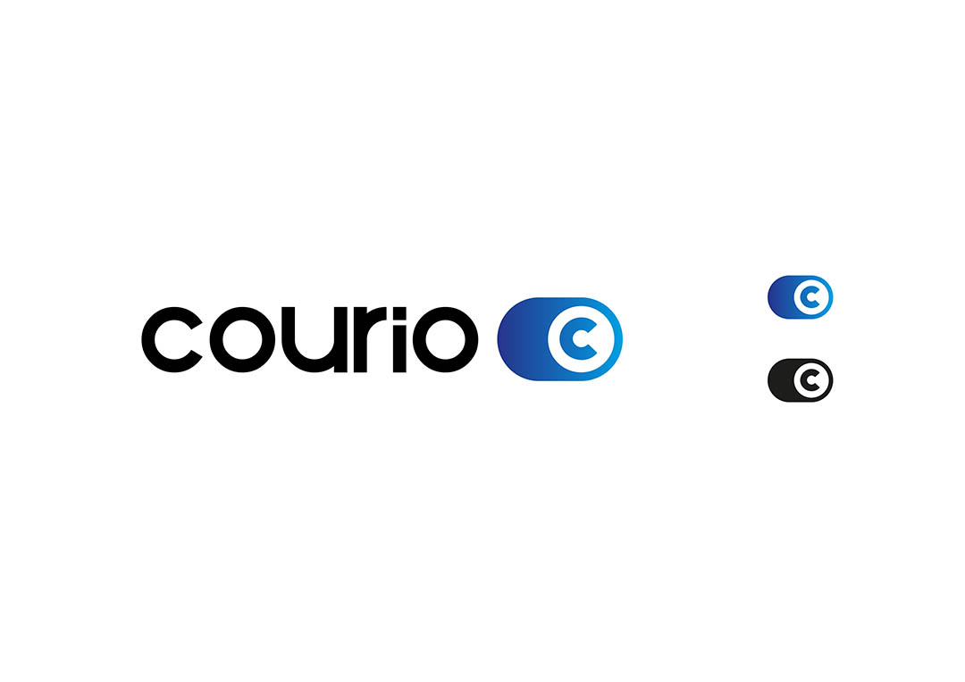
Design mimics switches found on smart-phones
and modern software indicates to the user that the software is as easy to use as their phone. As well as communicating that this is a digital product/service that can be used on both desktop and mobile platforms. The logotype has been set in lowercase to match the easy vibe of the mark.
Because the branding will primarily be displayed in digital contexts I have opted to use a gradient in this concept instead of a flat colour (which is traditionally optimised for usage in print first branding).
The tag line “the easiest way to manage your logistics,” when paired with the logo switch logo indicates that integrating into the platform will be as easy as flicking a switch.


