Blutack: Ad Campaign
Stick it up
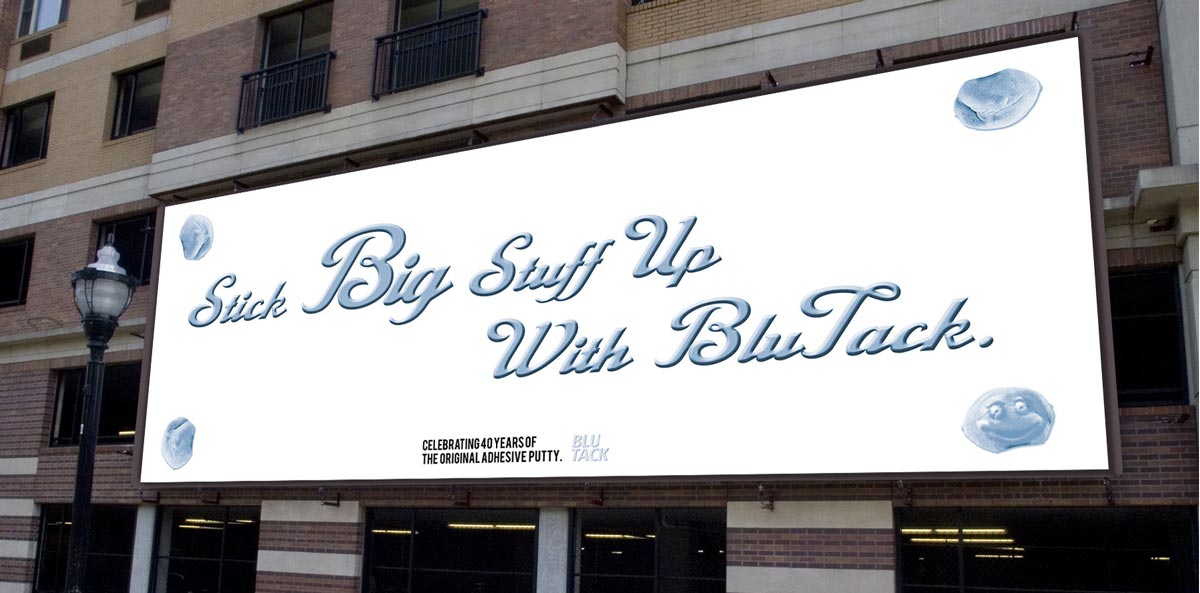
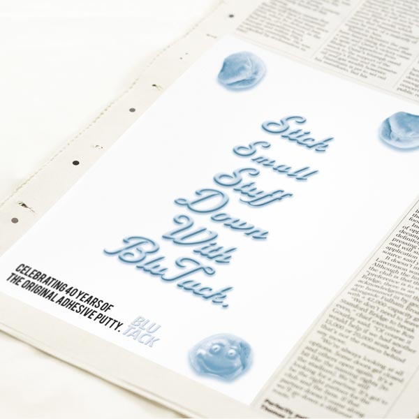
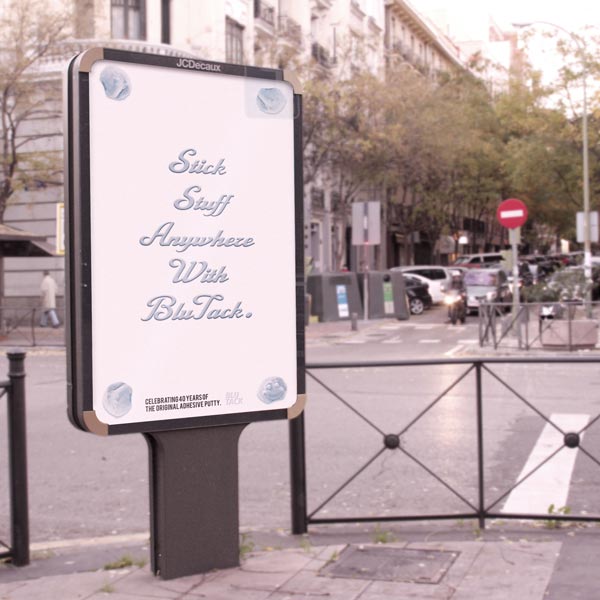
A guerilla-style advertising campaign where the message was tailored to the size of the medium that the ad has been applied to. For instance, the message has been modified to read “Stick BIG stuff up with blue tack,” when the advert is on a billboard when the message is quarter page size, the copy reads “Stick small stuff down with blue tack.”
This shows the versatility of the product as it can be used for larger and small jobs.
The art direction used the iconic visual of 4 corners of blu-tack, this communicates to the audience that something could be placed here & that they can choose what it is, in this instance, the audience will project their needs into space.
The typography of the advert is very personal to me, as a child, I used to spend the school day making a model with blu-tack. these models would be people, letterforms, dogs cats anything that you could think of. Additionally, the brush script style of the typography highlights the flexibility of the product.


