ARM Secure Logo


Complete – Concept 1
Personal / Traditional
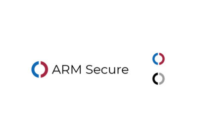
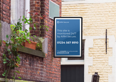
The circular logo is an evolution of the current VRC design, using two halves makes the mark more distinct i.e. isn’t a circle, the two halves depict completeness & unity. The blue is taken from the current ARK logo & the maroon red is taken from the VRC logo.
Additionally, this color scheme echoes the red & blue used in the APG logo. The sans-serif typography is light and modern allowing the viewer to see the logo first.
Professional – Concept 2
Comprehensive
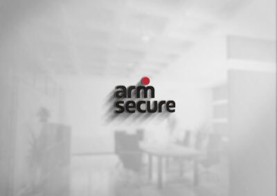
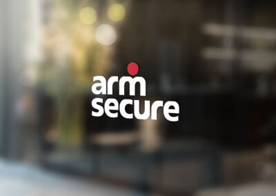
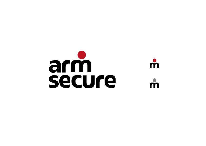
The red circle is synonymous with the “•REC” icon which is related to recording and monitoring, additionally, this builds upon the VRC’s use of the circle in their current logo. The typography is called “reason-system” which is used in the current ARK logo.
Positioning the circle over the top of the “m,” forms the upper half of a person, with the circle being the head, the M forming two shoulders & the stem of the M creating a pair of arms. The lowercase type and depiction arms of the character provides a light and friendly feeling whilst displaying a mild sense of humour.
The union of the two most recognizable elements from both ARK &VRC best depicts a merger & customers of both companies will recognize these elements.
Infinity Arm – Concept 3
Comprehensive/Coverage
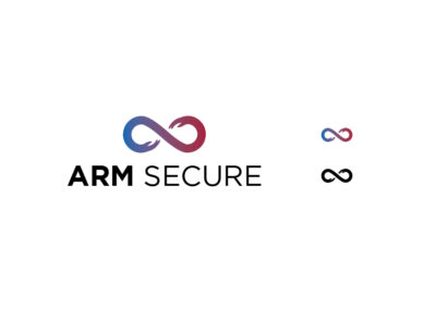
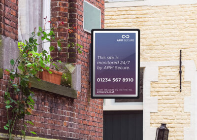
The logo here is the infinity symbol, this tells customers that ARM Secure is powerful and endlessly versatile. The symbol has been edited to include a pair of hands making the loops of the symbol into arms.
This pair of hands indicate a union both between the merging companies a more importantly in the customer’s eyes a partnership between security service provider & themselves.
The color scheme is a gradient of both the ARK blue & VRC maroon again depicting a union of the two companies and their respective services. The logo has been set in “Gotham,” which is a typeface used in various political campaigns for its simple & honest aesthetic.


