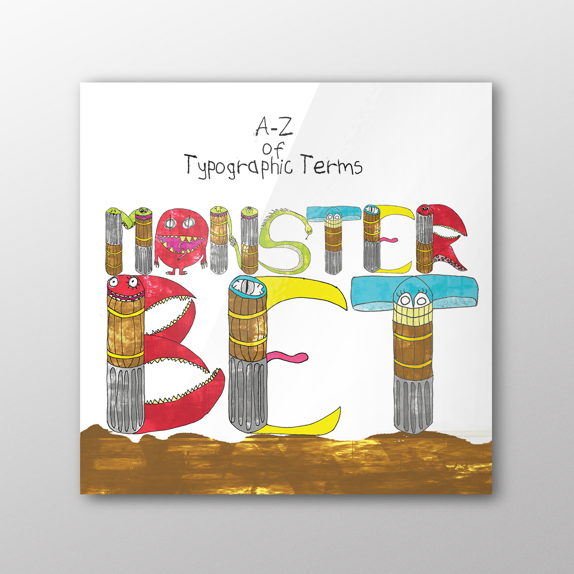
Monsterbet Book
One of my favorite student briefs.
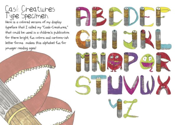
Additionally, the brief stated that all letters in the typeface MUST be monsters. These monstrous letters would then go into a printed hardback “A-Z glossary of typographic terms.”
I called the typeface and “MONSTERBET,” I choose to lay the book out as though it was for a child. I visited the library and took inspiration from various kids books. My favourite was “The Hungry Caterpillar.”
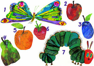
Inspiration
After reading it as a child, I never forgot this book because of the beautiful art style, the characters are almost Roald Dahl-like & feature bright varied pastel colours. On top of this, they sketchy and imperfect which matched the way I had done the lettering of the typeface.
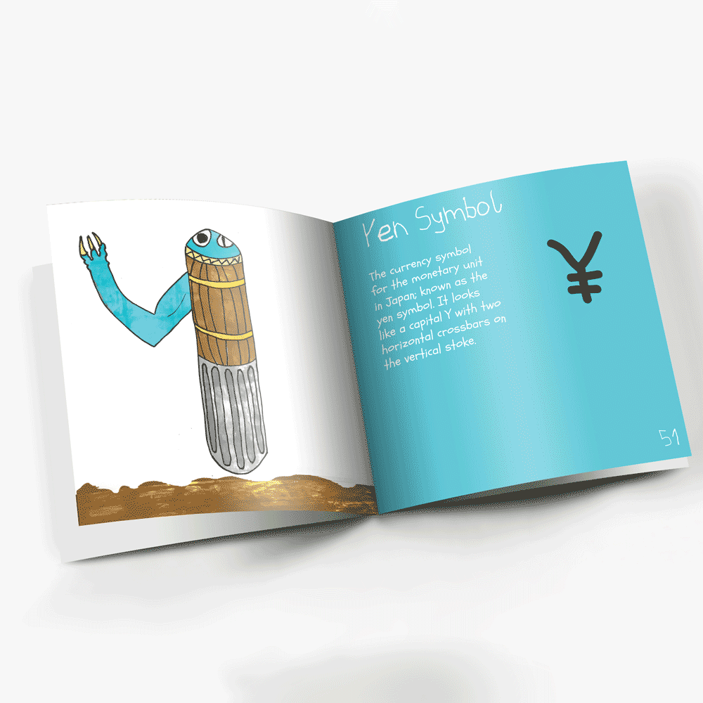
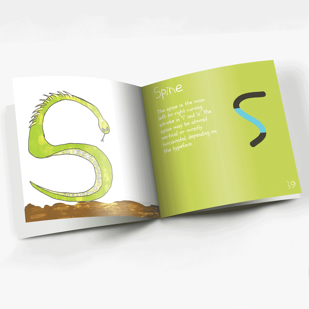
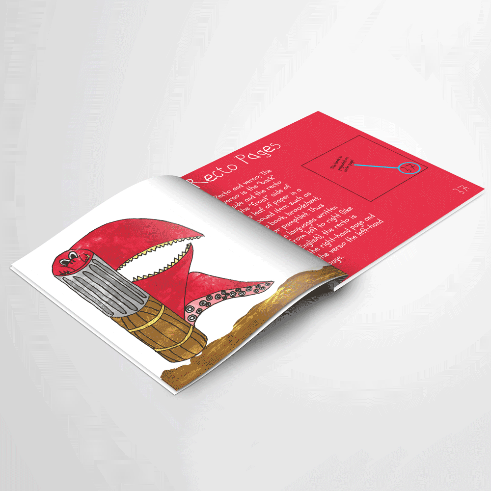
The layout out always featured the character/letter on the ‘verso page,’ (left) and the ‘recto page,’ (right) had the matching typographic term. The hierarchy of this page featured a more childish script typeface as the title. A more legible script for the body copy. Finally, there was also a diagram on the right page of what the term was.
This project encouraged me to adopt different art styles and learn more print production, which makes for better artwork.


