Unmuted Deburnay’s Covers
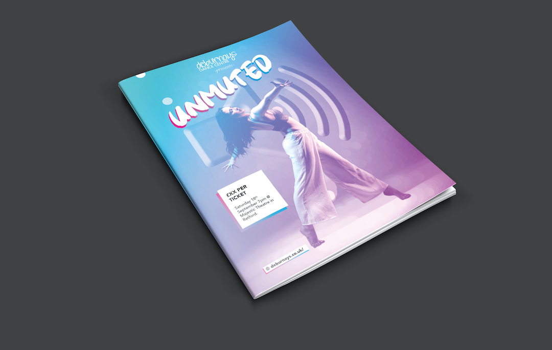
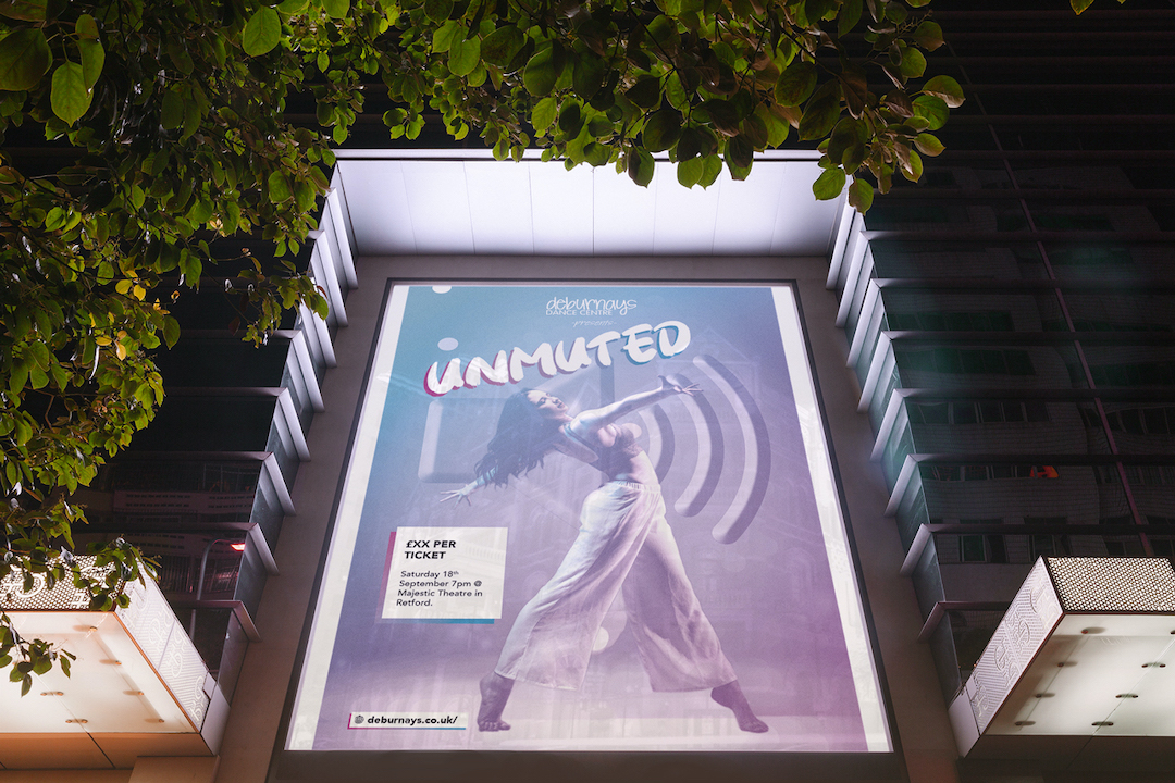
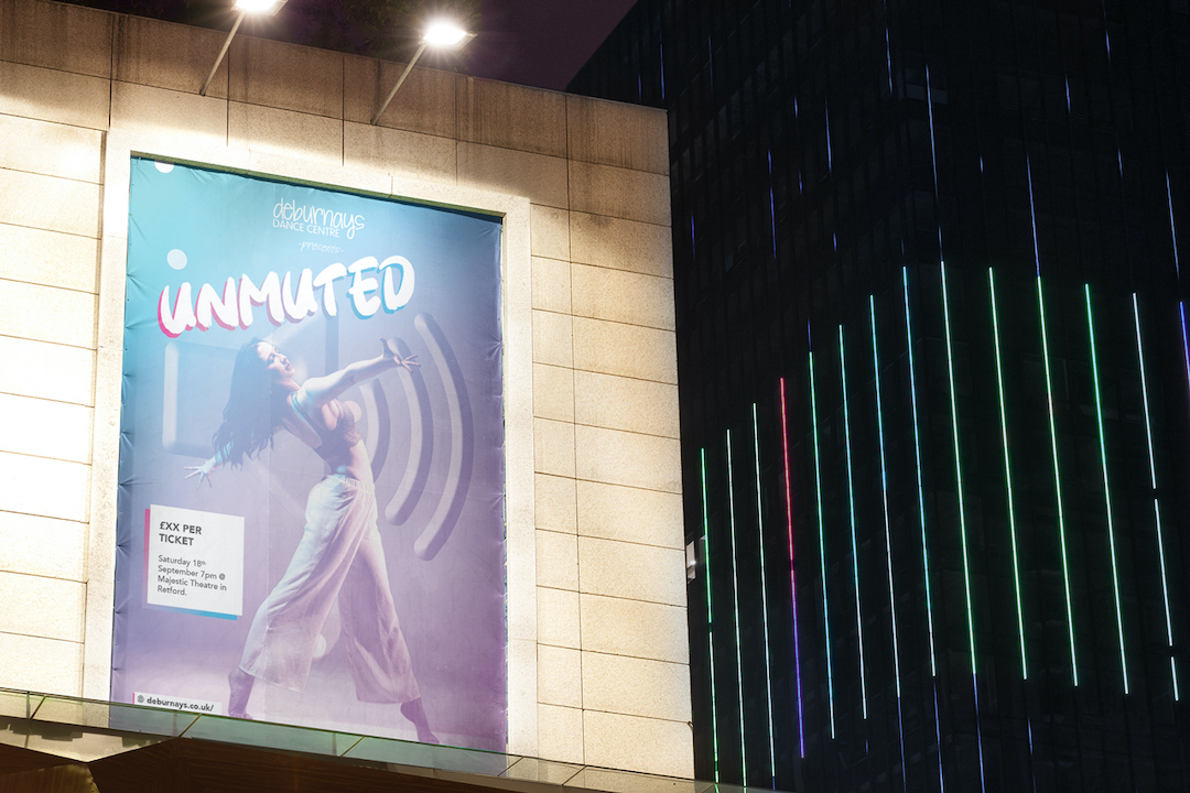
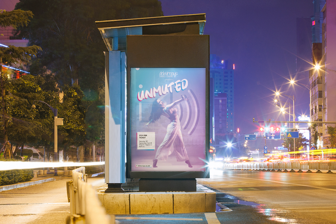
Electric Fade – Concept 1
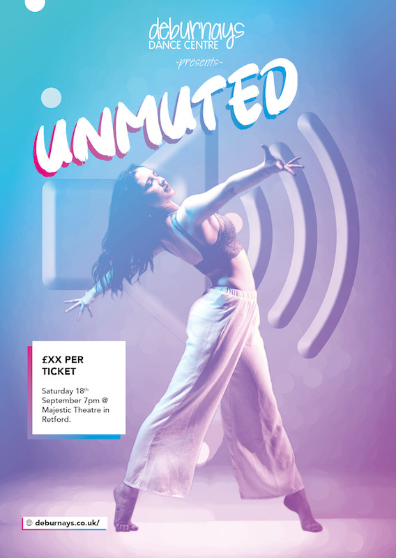
Bright, Colourful & Hopeful
Using the electric fade style to highlight a dancer, the gradient used is subtle pink to blue this dynamic colour combination is bright/hopeful, echoing the nature of the show that we have brighter days ahead of us now that lockdown is lifting and we are returning to normality.
A bokeh (blurred circles) effect has been applied to the background, this visually places the dancer in the foreground by separating her from the background.
Additionally, behind the dancer, there is a volume up icon which is an appropriate symbol for the name of the show. The icon has a visual synergy with the dancer with her open arms facing the same direction as the audio waves of the icon.
The typography used is a heavy brush script, which gives the poster a human feel further echoing that this is an in-person show.
Bold Simplicity – Concept 2
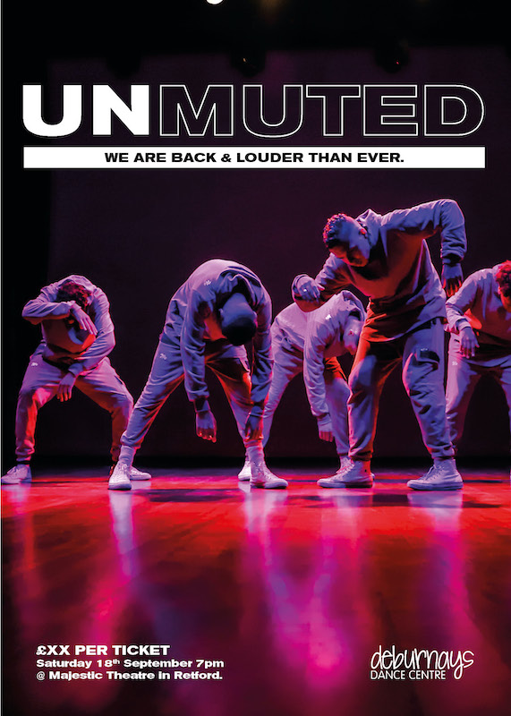
Bold/Clean
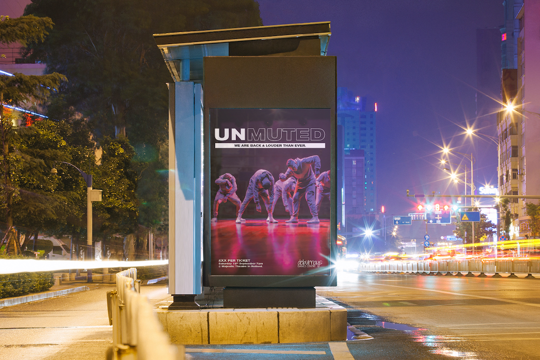
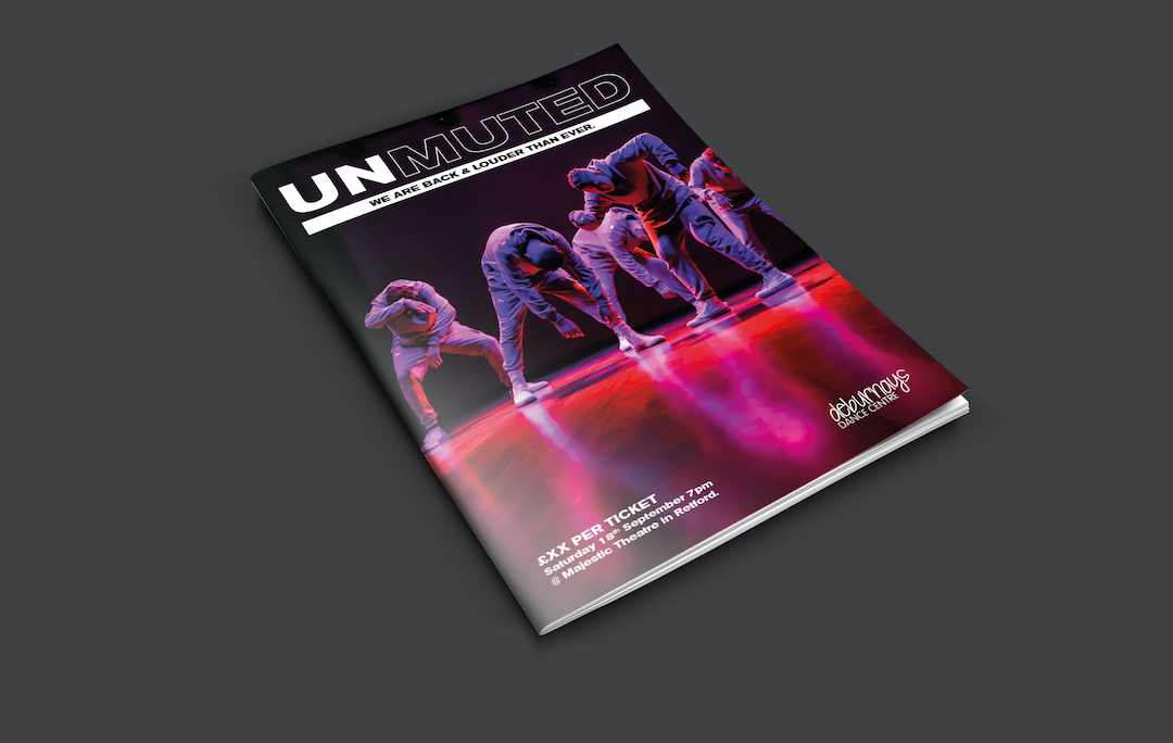
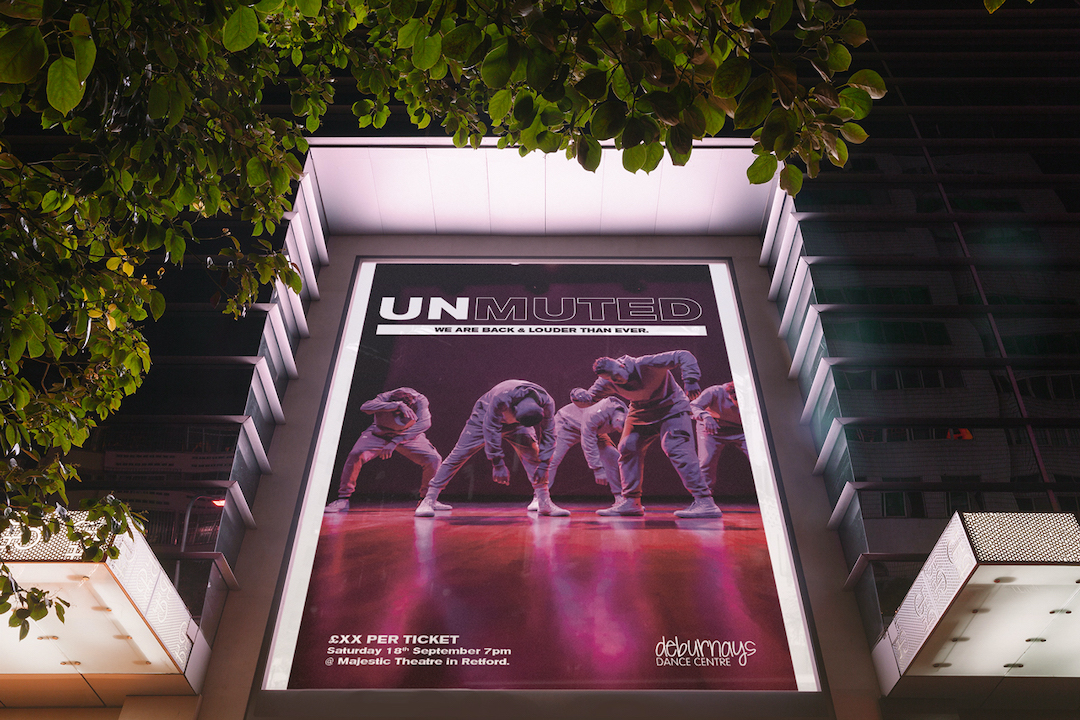
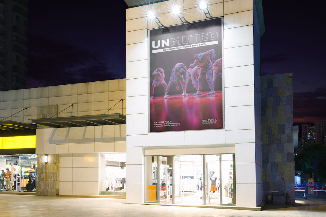
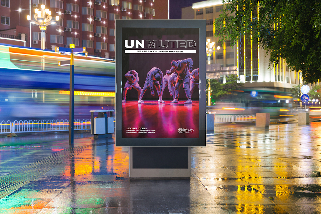
The main photo used shows some live dancers rising, almost as though they are waking up & have been unmuted, reanimated, brought back to life.
This echoes the nature of the show. The typography is a bold extended type that has come back into fashion in the last year particular used in music and other entertainment media.
The word “unmuted” has been split into two parts “UN,” & “MUTED,” UN has been left solid to add more emphasis to the more actionable prefix of the title and “muted has been outlined to lessen its significance & visual hierarchy.
The imagery and layout are very simple and clean which allows the focus to be on the contrast between the two parts of the title.
Classy Redline – Concept 3
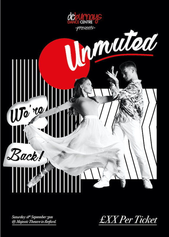
Dynamic/Loud
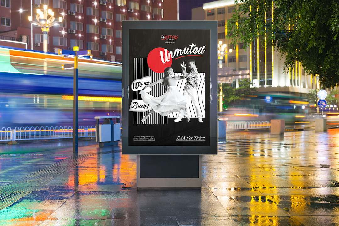
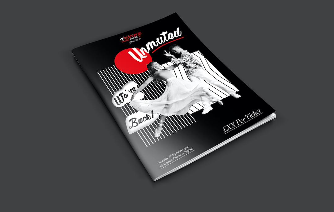
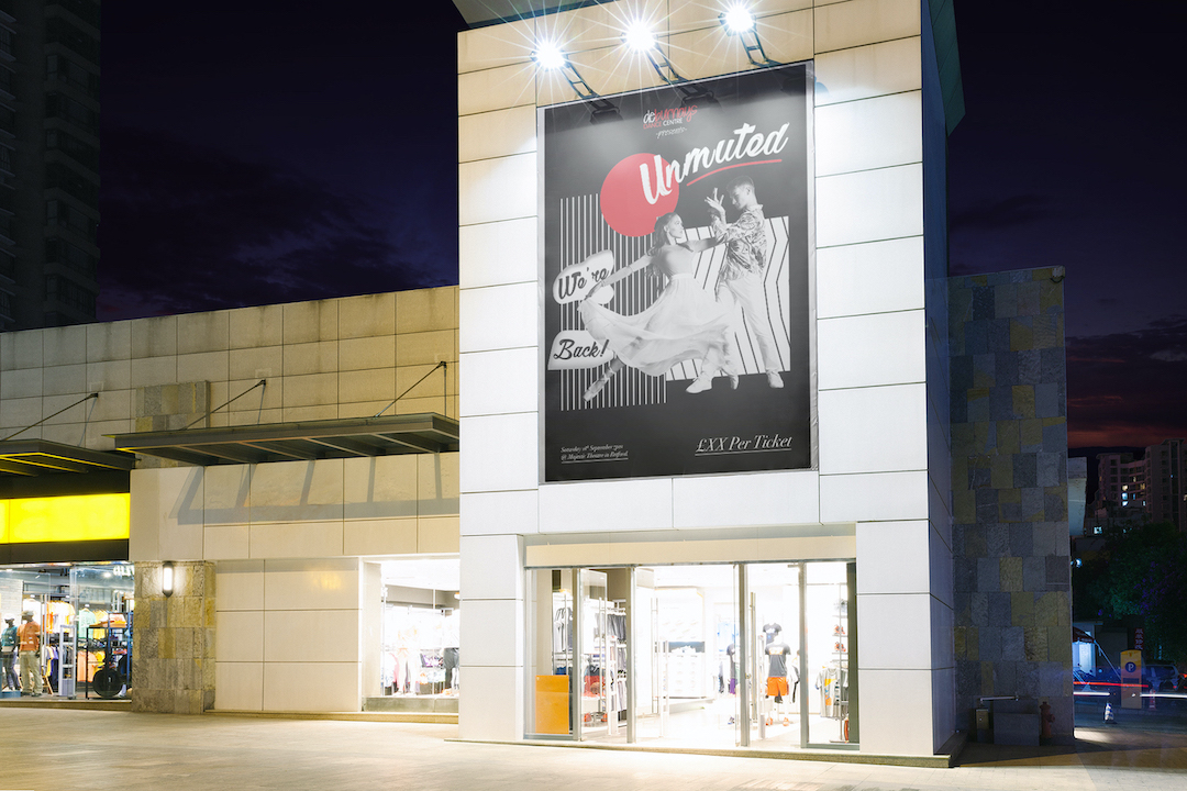
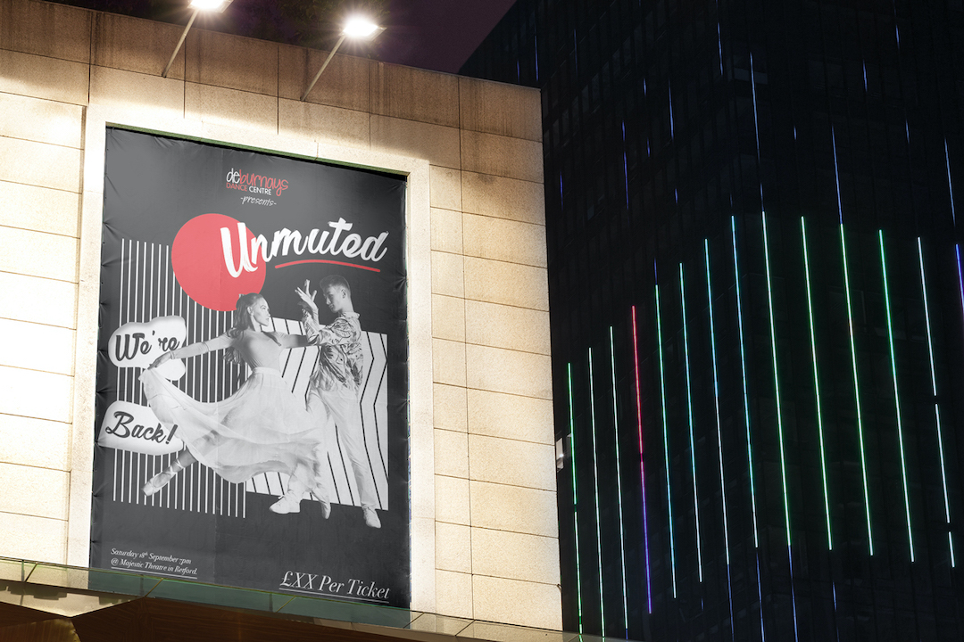
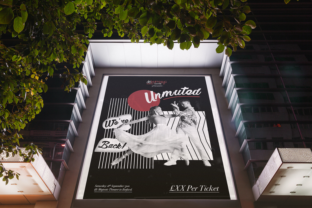
A photo of two dancers has been cut out from the background to which allows the viewer to focus on the dancers making it clear that this poster is for a dance show.
Using Deburnay’s brand colours in the photography and graphics reinforces the branding on the poster, so somebody that is familiar with Deburnay’s will instantly recognise this poster as for a Deburnay’s show. The poster has been visually layered with graphics which help bring the dancers into the foreground.
The graphics themselves are black and white creating high contrast and make the image have a visually loud quality making the poster very striking and unmissable. For the title, I have used a more elegant brush script again selected for its human qualities echoing that this is a personal show, the brush script is contrasted against the serif typography which helps enhance the classy feel of the design.


