On-Time vs Bob’s Plumbing
OnTime Campaign
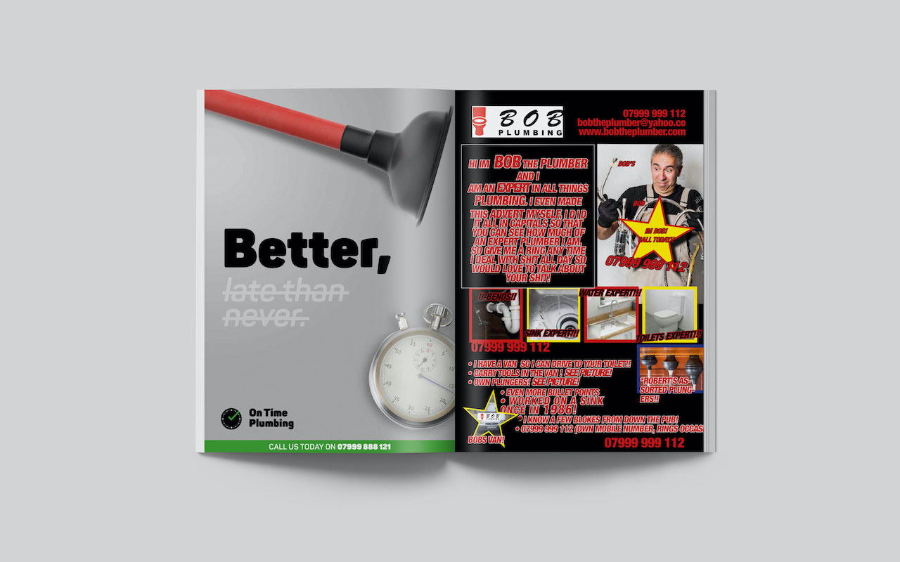
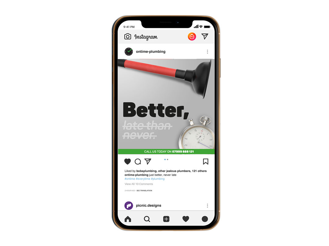
After developing the logo I wanted a campaign that reflected the brand values, in this case, it means highlighting reliability. The tagline uses the famous saying “better late than never” but has been modified so that the “late than never” has been struck through to indicate that this part is incorrect. Leaving just the word “better.”
Additionally, the imagery in the campaign features a stopwatch which is related time and implies that the service will be fast which both on brand and highly desirable to a customer in need of plumbing services.
Bob’s Campaign
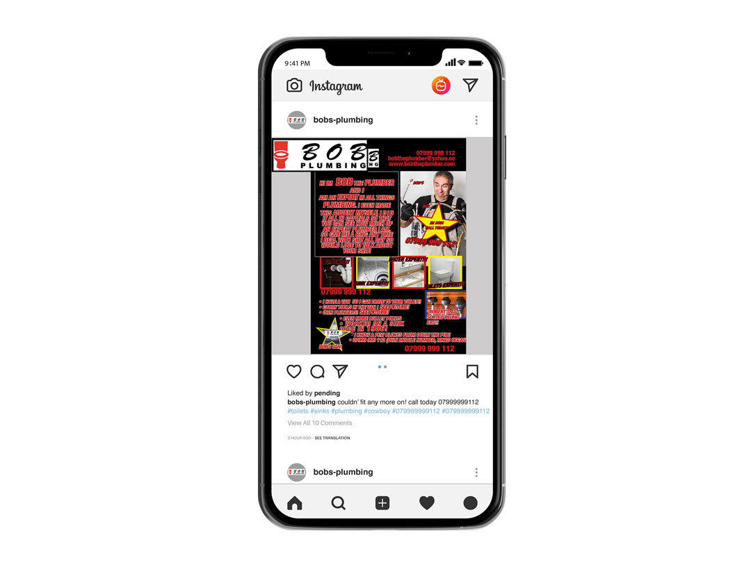
Inspired by the over the top layouts of ads featured in local print magazines. I wanted to create a “cowboy advert,” to do this I violated all the rules of graphic design and typography (all caps, centered text, stroked text, bad leading, kerning and spacing & of course “MAKE THE LOGO BIGGER”).
Unfortunately, when putting ads together companies ask themselves…“What else can I get on there? We have the phone number 100 times, the logo is massive, we have paid for the whole ad space and intend to cover all of it.”
Find a branding and marketing expert & don’t be a Bob.

Scalability & Colour
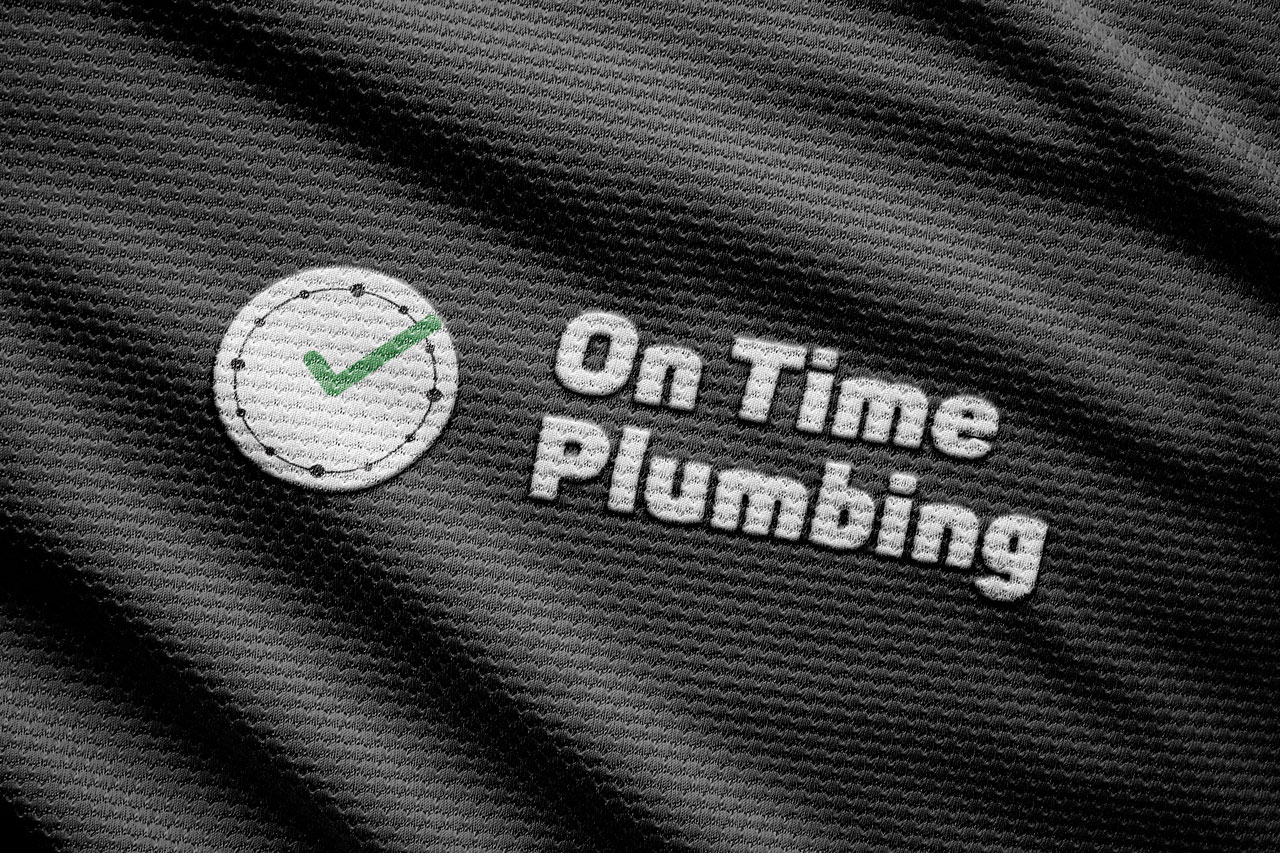
Logos shouldn’t be detailed, they should be simple and iconic. Which lends itself to scalability it must work at both 1 meter wide and 1 centimeter as well.
Logos should also be identifiable in mono formats all-black and/or all-white. This will provide flexibility for the logo to be used in different ways.


