ProDetect Branding
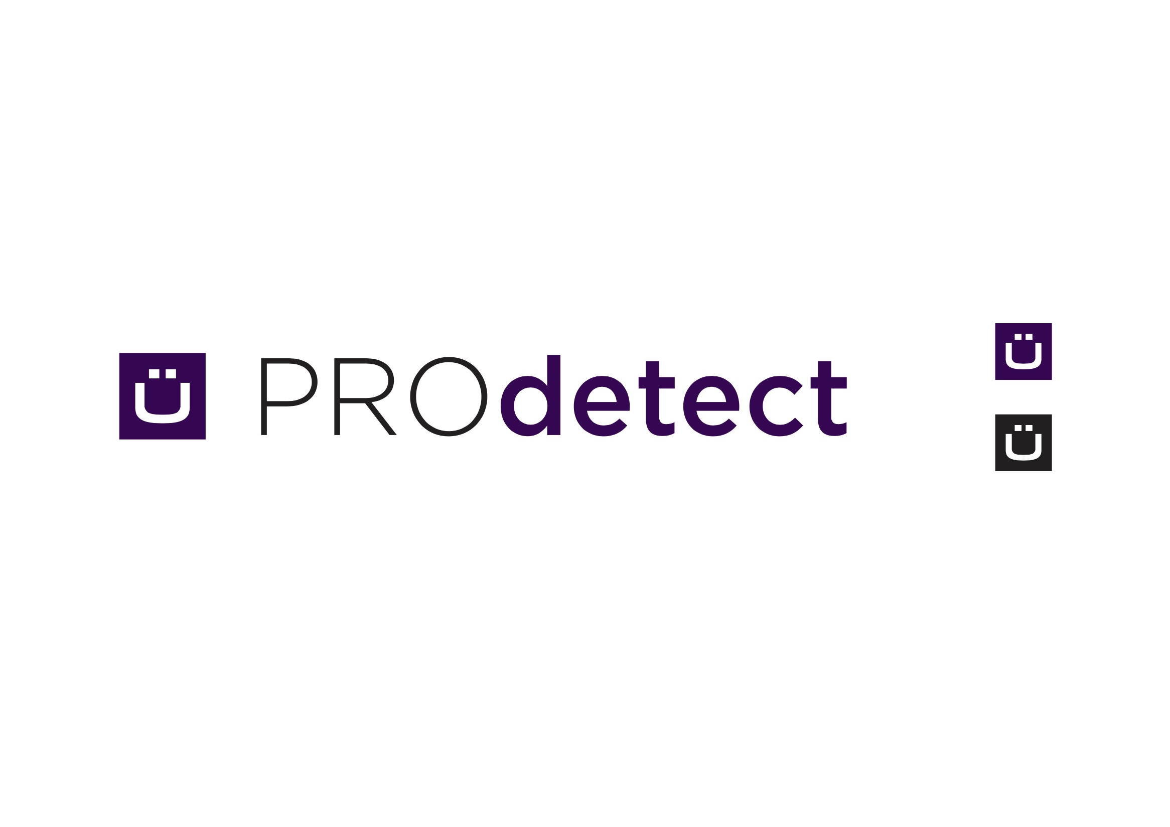
“You-Happy-Little-Umlaut” – Concept 1
PRECISION/SATISFACTION
The logo is a boxed umlaut that doubles as a smiley face. The umlaut is synonymous with the German language, this a connection between Pro-detect and German precision.
This logo is all about “the customer,” (you/u) much like the company. It was mentioned initial meeting that it will be about customer satisfaction and services will adapt to them.
The smile represents making the customer happy and them feeling satisfied with the service provided.
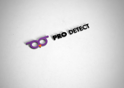
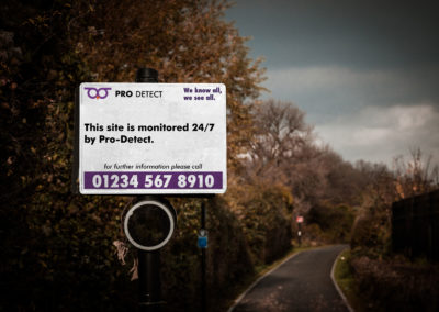
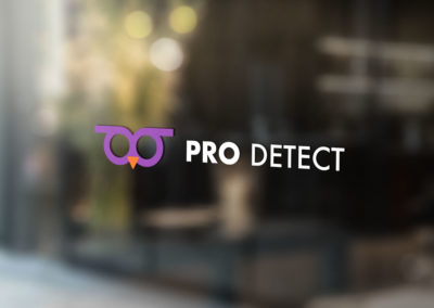
“Anthropomorphic Owl” – Concept 2
TRUST-WORTHY/WISE
Using an owl allows Pro-Detect to benefit from the way we see the animal ( we project human qualities onto animals), they are seen as wise and by extension are trustworthy. Their large head/face and eyes give them more human quality.
There are many other associations with owls that we would inherit by using an owl logo. (insight, mystery, sense of awareness, intelligent, nocturnal, super-human/advanced senses & calmness of owls.)
Telling the customer we provide an intelligent/ trust-worthy service.
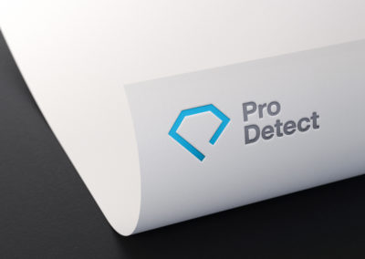
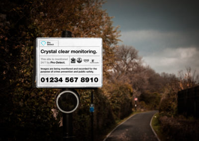
“Diamond-P” – Concept 3
SIMPLICITY/CLARITY
Diamonds are clear (mostly) and the logo has been illustrated in the simplest way possible, a single line (forming the shape of a “P”).
This design is inspired by Swiss design (strict adherence to the grid, asymmetry & sans serif typography).
Helvetica has been used as it is the quintessential Swiss typeface, additionally, the type-layout builds upon the grid and amplifies the simplicity of the mark.
Telling the customer the service is clear and simple.


