Peckish Birds Branding
Peckish Birds Logo Brief
What was described was a POS stand that could be set up in stores, She wanted it to look like a tree, highlighting how organic and natural her product is.
During the development of the POS-stand, it was clear that this project needed a logo.
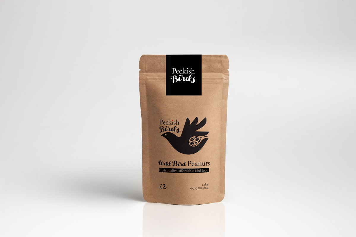
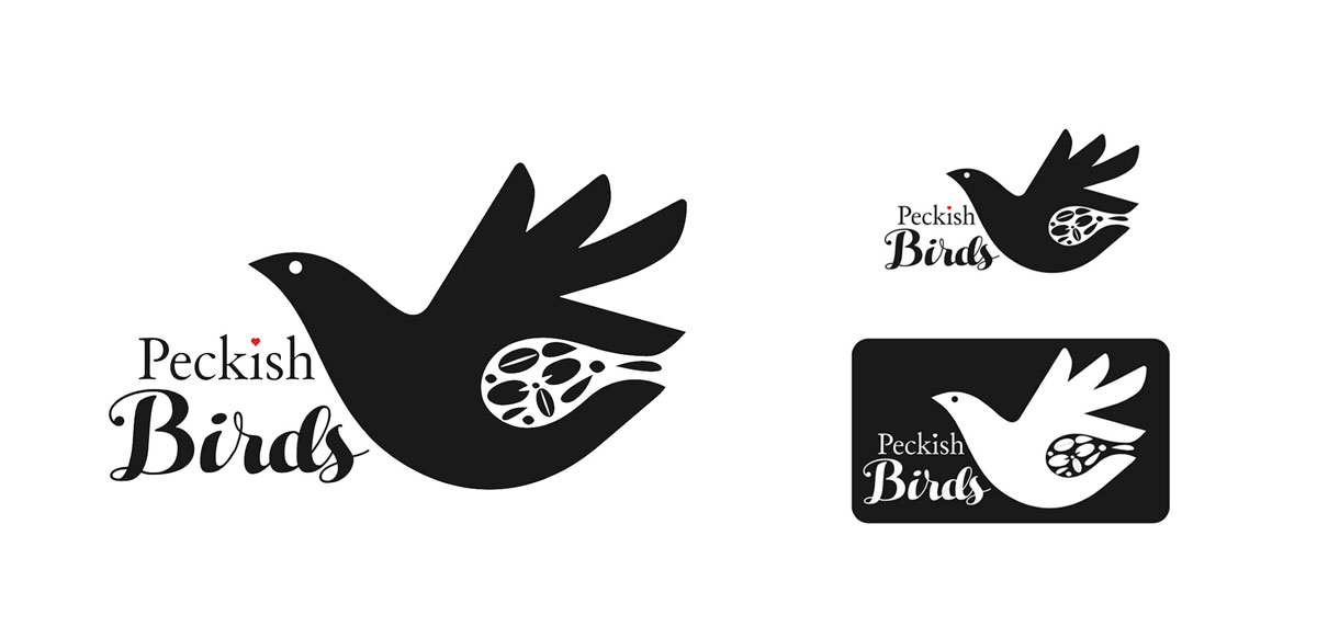
A graphic that combines a bird with a handful of seeds. I chose a handwritten scripted typeface for ‘birds,’ to communicate how this is organic and natural and will be the product is packed by hand (not machines) and it is hands that will also feed the birds by. Finally, the “Day Roman” typeface is used, this was chosen as the founder of the project comes from a religious background, “Day Roman” Is used as the typeface in various Bibles.
I also did a business card and leaflet for Peckish Birds.


